The easy parts were already done. Ryan had a recognizable logo, thousands of dollars of printed collateral in the world, a Facebook presence customers followed for the bits, and a nickname people actually call him by: the Sodfather. You don't throw that out and start over.
So the job wasn't give us a brand. It was: take an established identity working on personality alone and build a brand world around it (website, ads, billboards, contractor pages, t-shirts, everything else) without losing what made it work.
The other thing shaping the whole project: this is a succession moment. Ryan's daughter Kaela is taking over the business. She's not a bystander on the calls. She's the next owner, sitting in because soon she's the one running it. Every brand decision was effectively being made for her.
The voice we found
People don't buy grass because they want grass. They buy grass because they want a yard. The yard their parents had. The yard their kids will remember.
That's the brand thesis. Grass is the conduit, not the product.
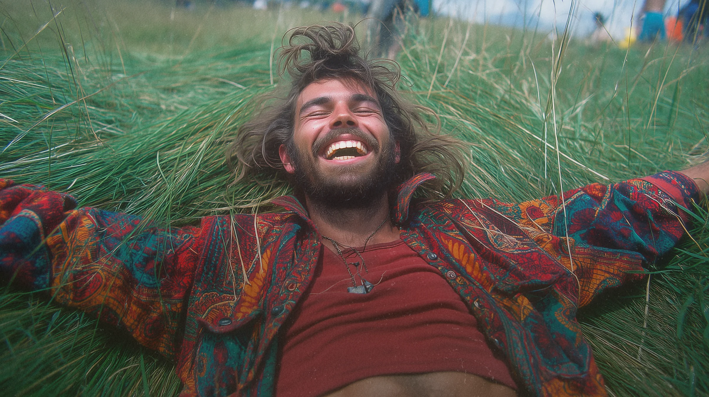
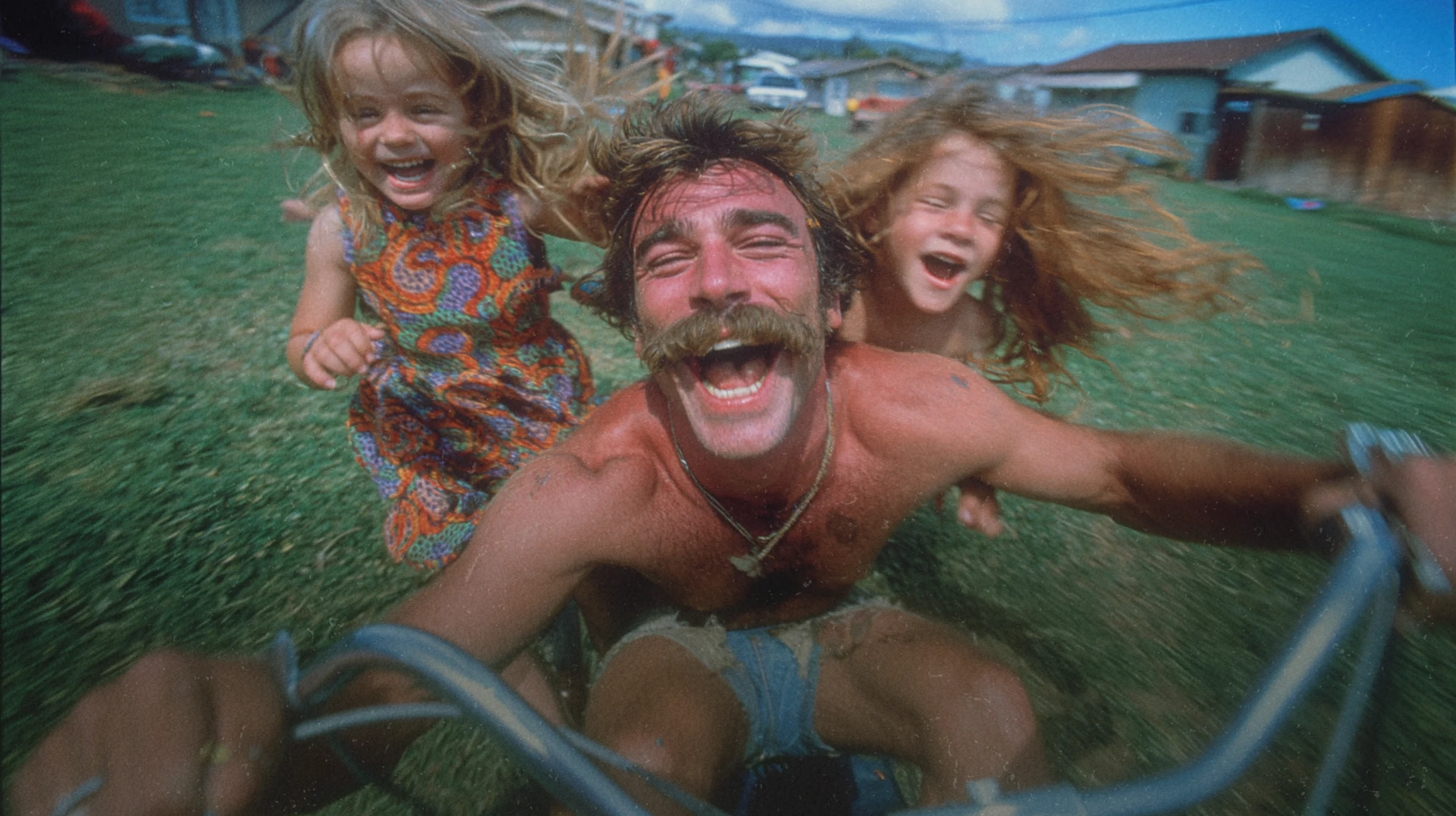
I built the identity around a phrase that came out of the work: the Front Yard Family. The customer Ryan is really selling to is a millennial: late 30s, just bought a house, just had kids, quietly grieving the early-2000s childhood they didn't realize was the golden era until it was over. The Wonder Years but with sod.
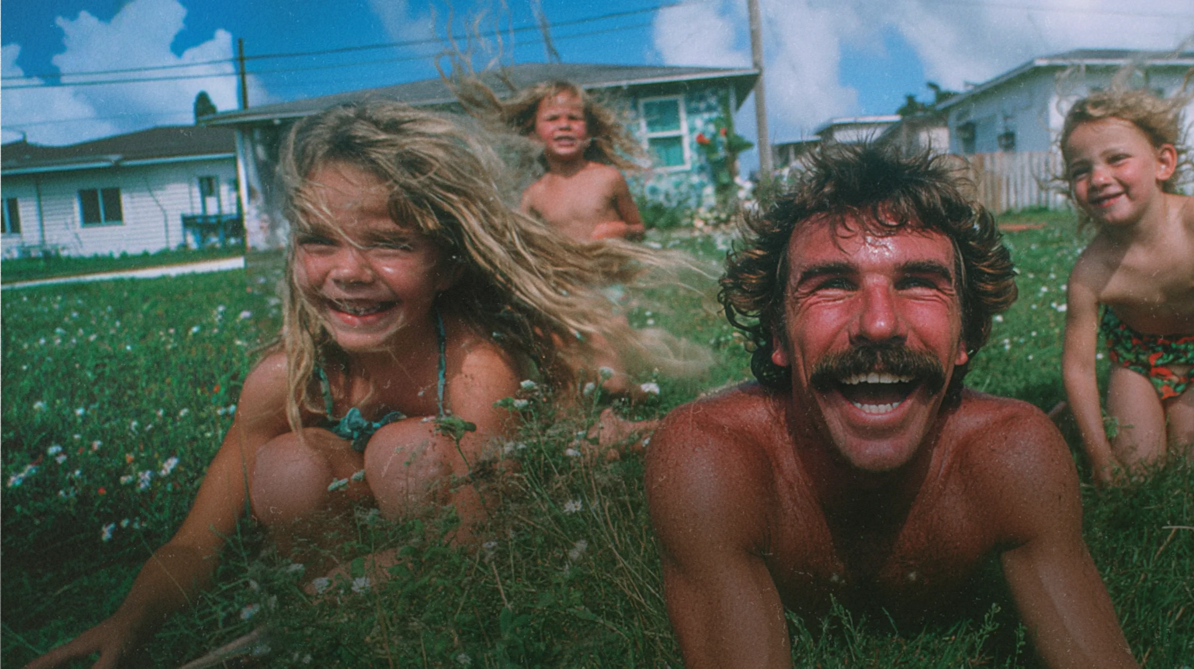
It helps that the business itself is a family business. Ryan is the dad at the center; Kaela is next in line. The Front Yard Family isn't just a customer fantasy. It's a description of who's actually selling the grass.
The brand sells summertime, warm tones, film grain, the smell of fresh-cut grass, the sound of sprinklers, being a kid again. The light-heartedness from the existing Facebook presence stays (the puns, the bits, the Sodfather) but it gets a heart now. The grass jokes and the "best memories are made outside" hero copy live next to each other and don't fight.
The edginess fight
The place this work got interesting wasn't typography or color. It was how evocative the brand was allowed to be.
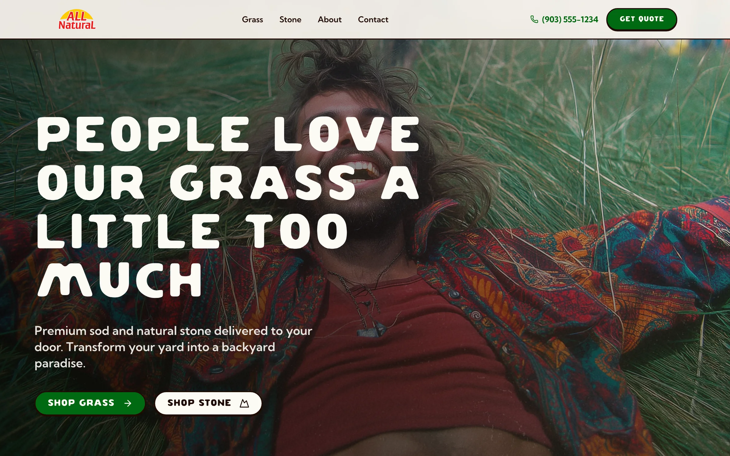
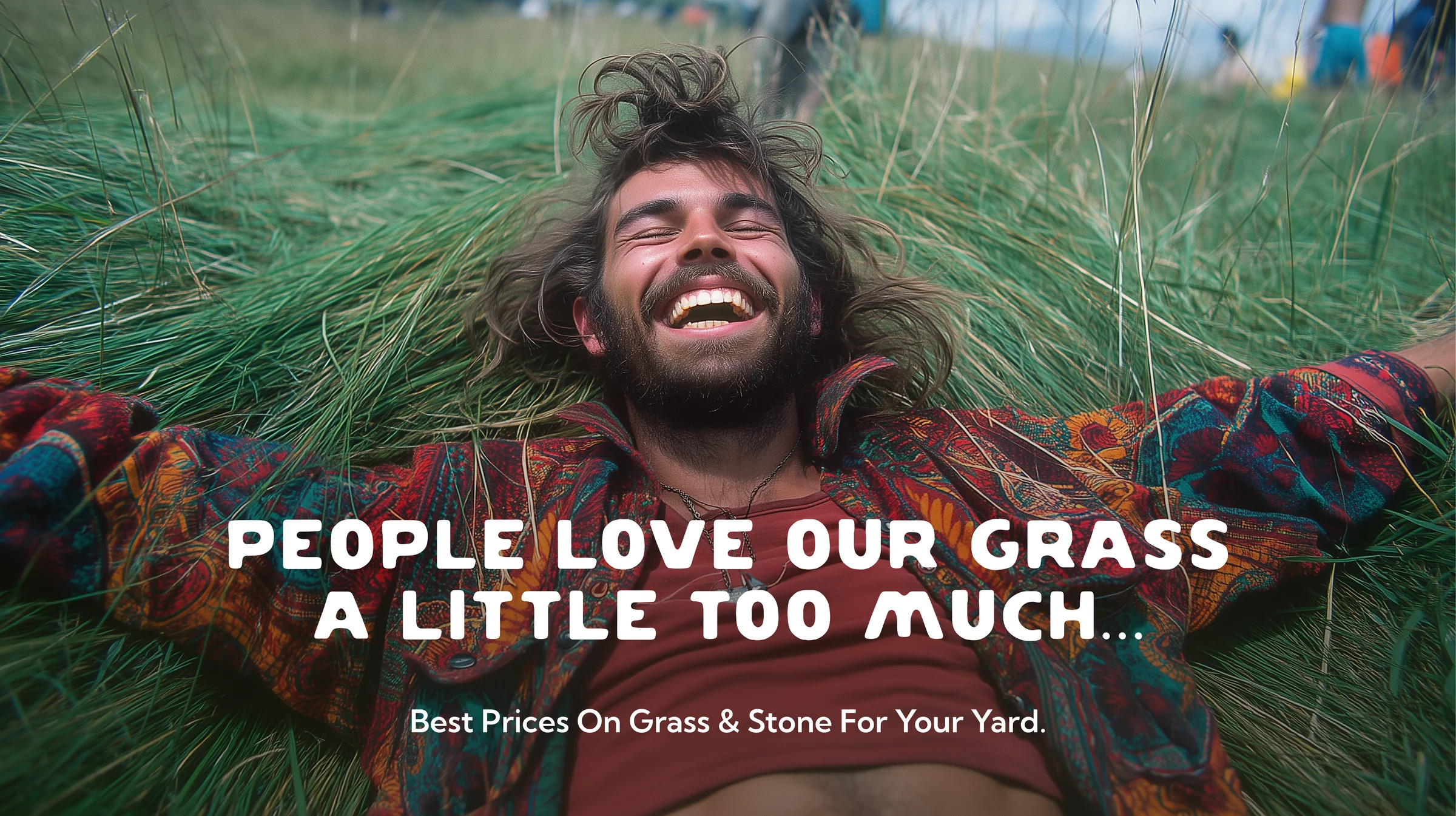
The Front Yard Family thesis pushed naturally into hyperbolic territory. People love our grass a little bit too much opens the door to bikinis in the grass, hippie girls rolling around in a fresh-cut lawn, a golfer napping on a putting green like he's on his honeymoon with it. Ryan's existing Facebook voice already lives in that register. Two to three inches is deep enough, with a straight face.
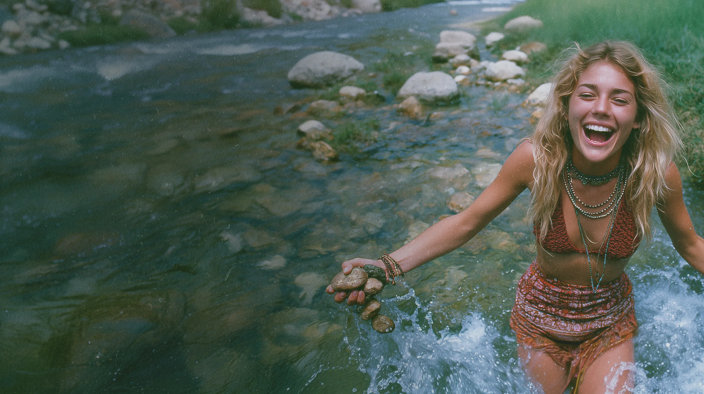
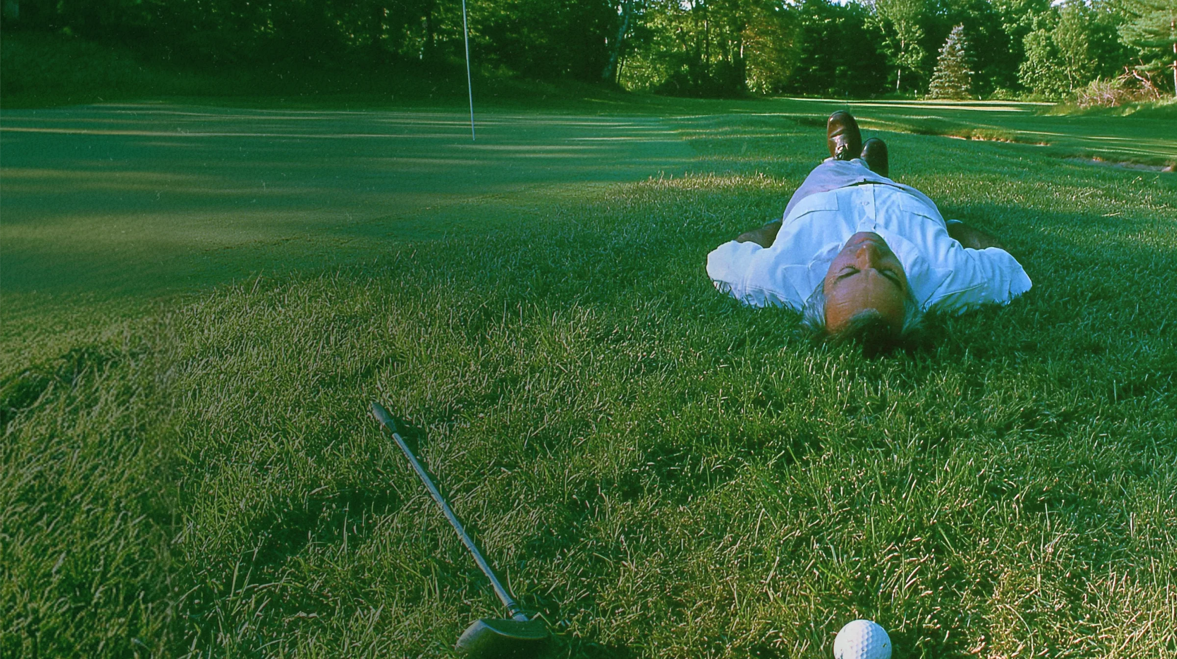
Kaela was scared of it. Reasonably so. She's the one inheriting the business, she could see exactly where the imagery was heading, and she remembered that a previous We Sell Grass billboard had gotten taken down after the local church complained. She wanted us to pull it back. More conservative. Don't pick that fight again.
Ryan vetoed.
Not harshly. This wasn't a power play. But he held the line. He's not afraid to alienate the churches. He's been alienating the churches for years. The brand is evocative because he is evocative, and the second it starts apologizing for that, it's no longer his brand.
He was right. And the more useful thing about the moment is what it actually was: a dad teaching his daughter, right before she takes over the company, a lesson about owning who you are. Don't shrink the thing that made it work to make it easier to defend. She can run it her way when it's hers. Right now, while it's still his, it stays at full volume.
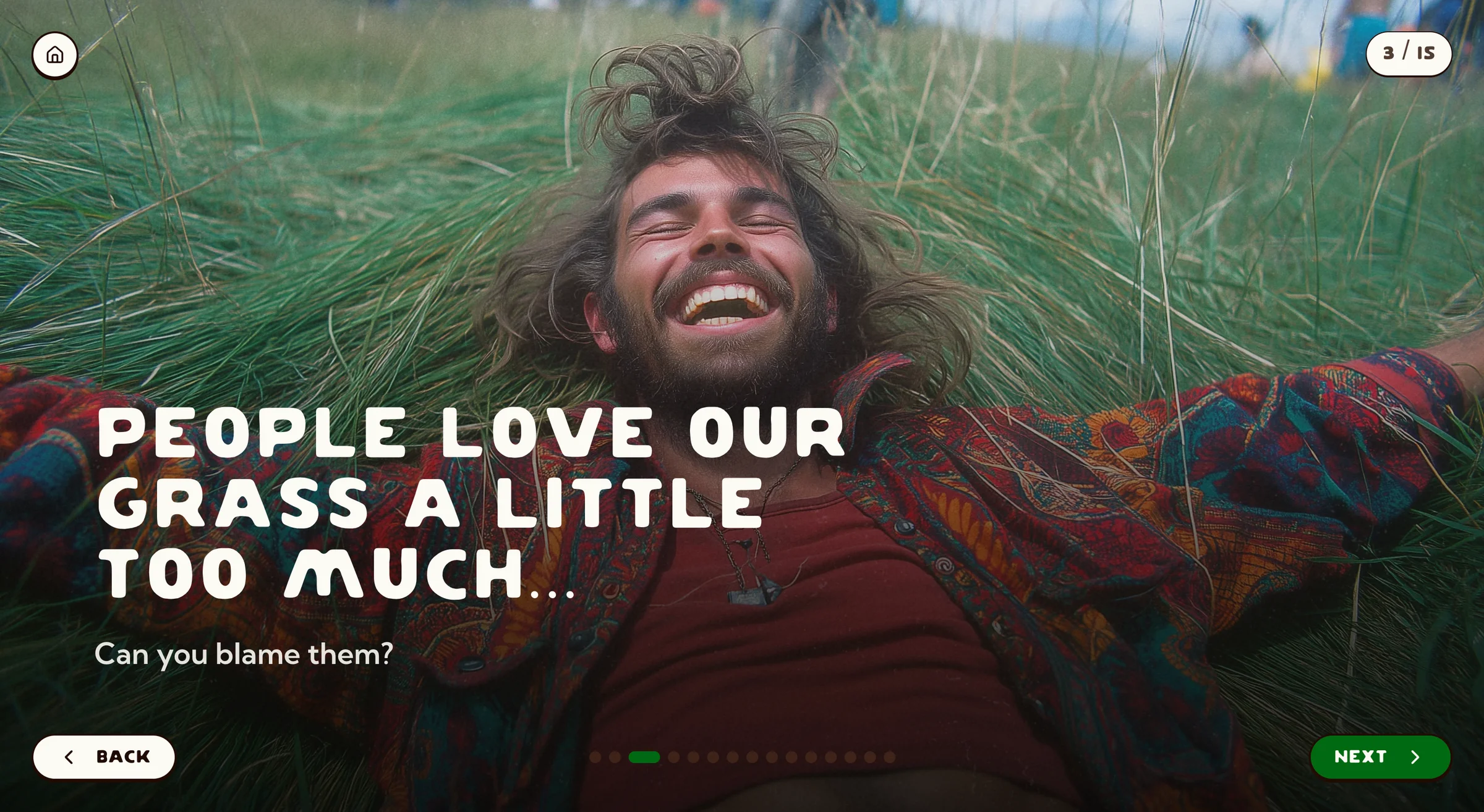
So the imagery direction held. We didn't tune it. We kept it on full blast. The Sodfather stays the Sodfather.
The work
Reframing the existing logo, not replacing it
The current logo is doing real work in the world. Trucks, yard signs, t-shirts. So I left the parent logo alone in spirit and did what big brands actually do: built a logo system around it.
- The primary lockup got minor cleanup: fixed letter-spacing, simplified the four-color gradient sun to a printable solid, slid the grass behind the word natural. The kind of changes nobody but the person paying the print vendor notices.
- Three alternate lockups handle the contexts the primary can't: tight spaces, small UI, a single-color wordmark for embroidered polos.
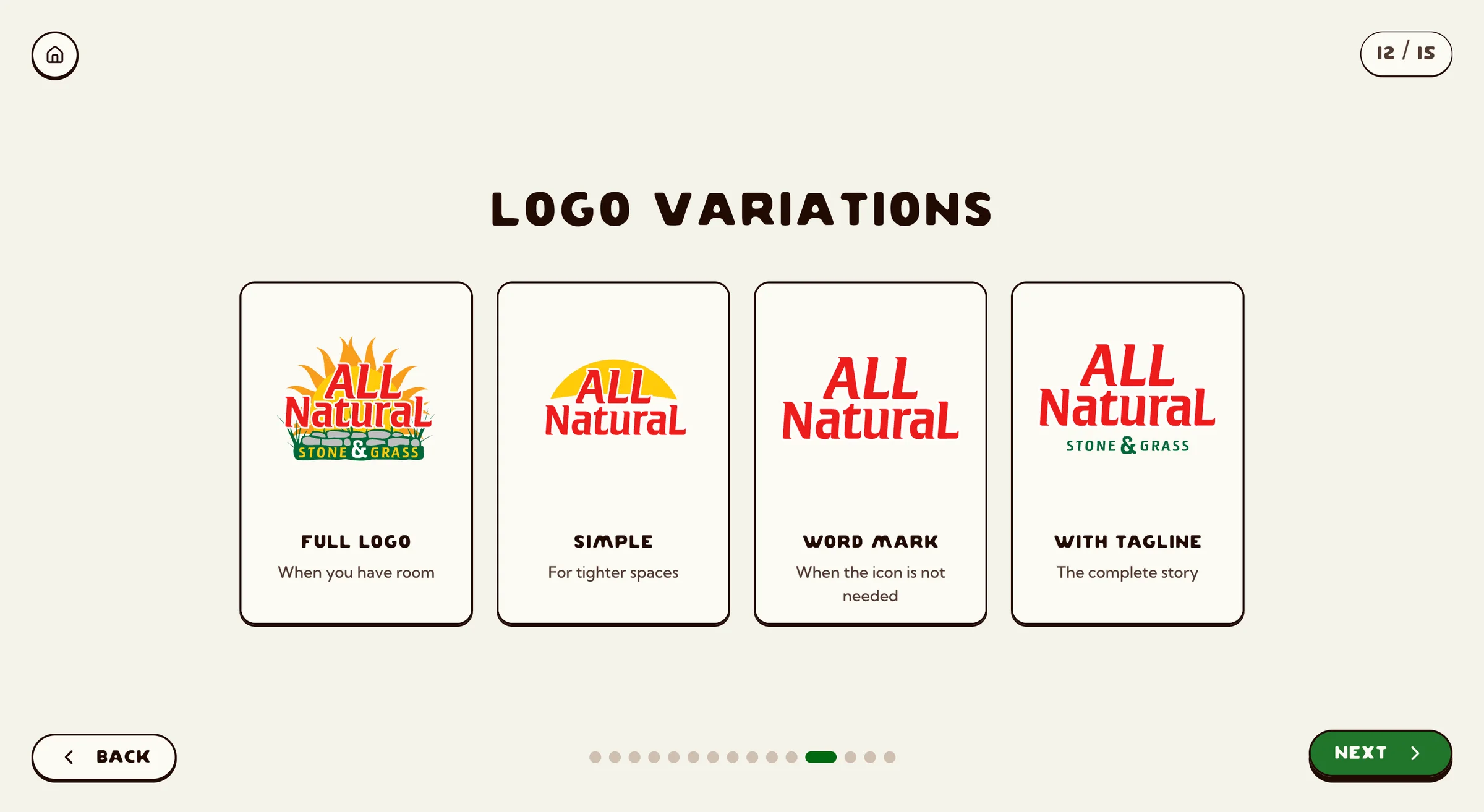
This is the Coca-Cola/Pepsi move. The crown jewel doesn't appear at every size on every surface. The simplified marks do. The crown jewel stays the crown jewel.
Color & type
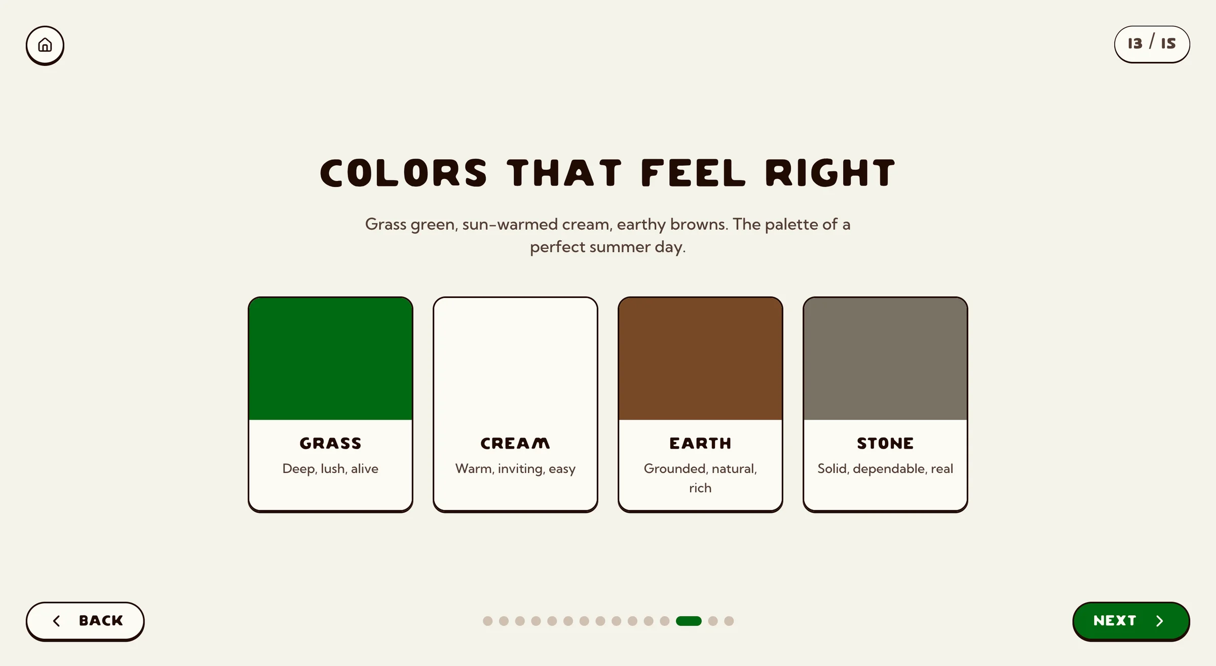
The brand red, orange, and yellow were already established and weren't moving. The new palette is supportive: grass-greens and warm earth tones that surround the existing logo colors and give digital surfaces somewhere to live. The point isn't to dominate; it's to make sure every button is the same grass-green every time, so the brand doesn't drift the second somebody else touches a file.
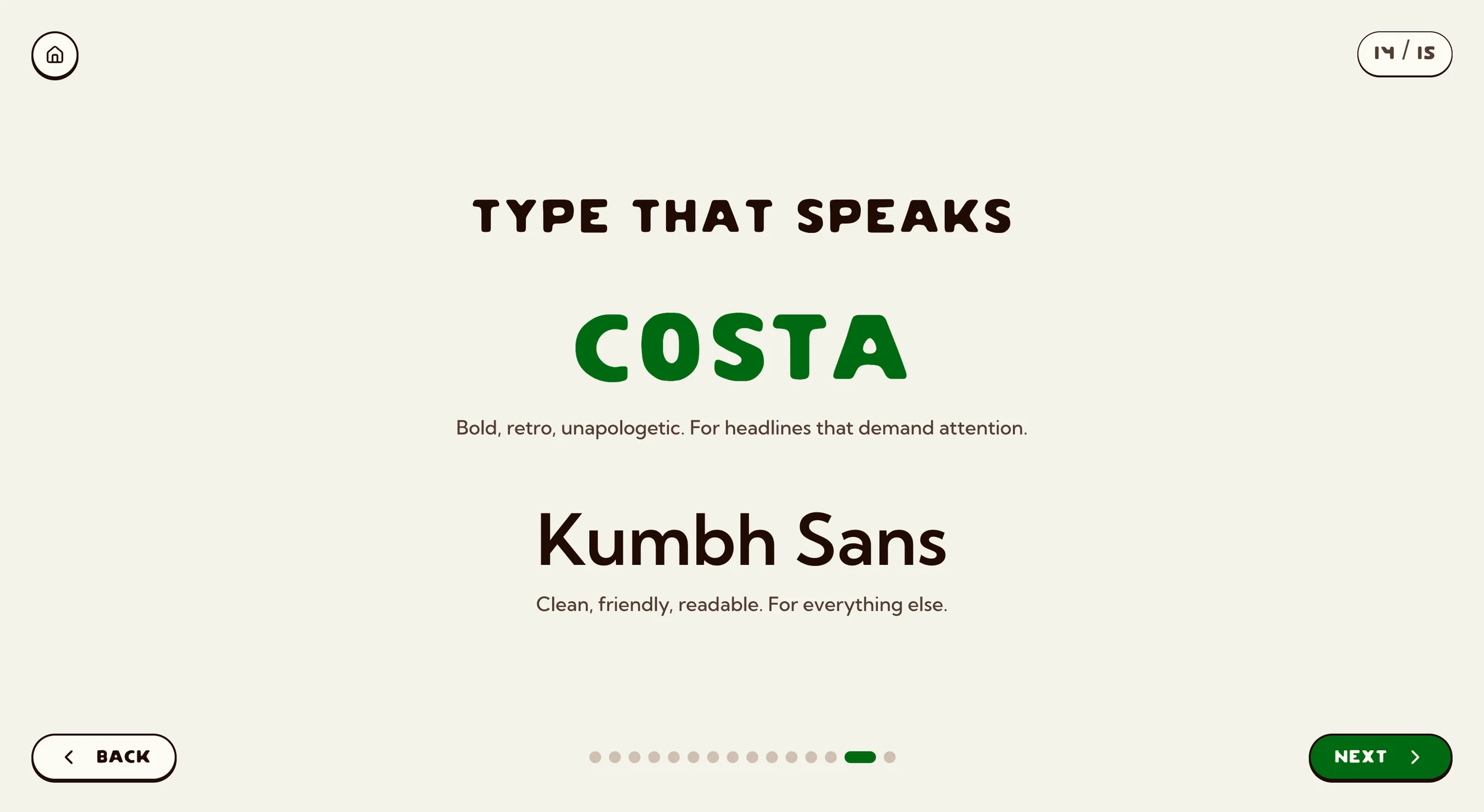
Typography landed on a two-face system: Costa for display (personality, carries the nostalgia) and Kumbh Sans for body text (gets out of the way).
The brand guide exists so a different designer in two years can pick this up, make an ad, and not have it look like a different company.
Imagery: softening the Sodfather
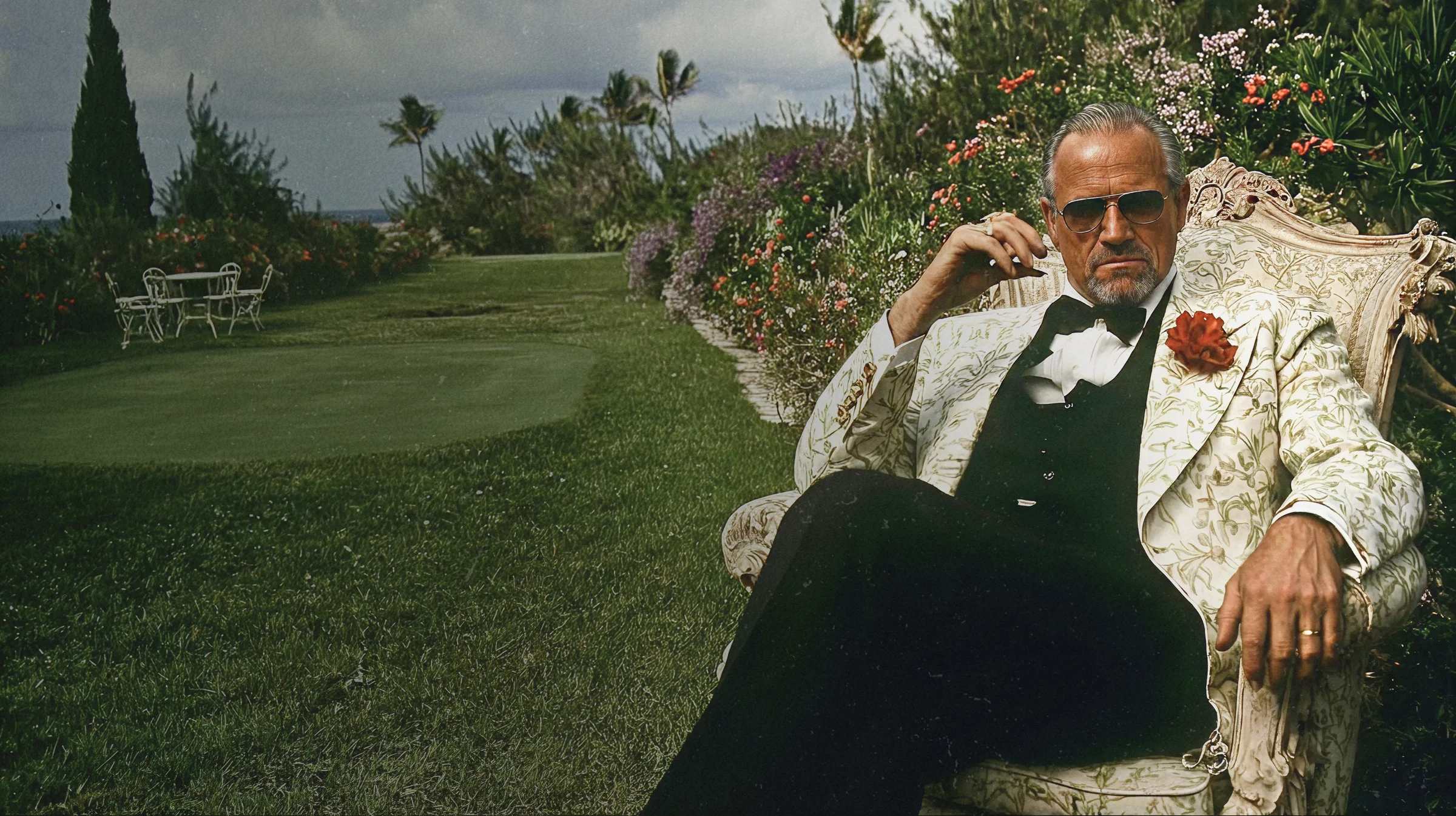
The existing Sodfather image on the site is a black-and-white portrait of Ryan that reads… intense. Like maybe-a-Sopranos-character intense. Funny, but off-key against a brand selling "front yard family."
So I softened it. Same character, same Godfather-coded gravity, pulled into a more natural setting and lit warmer. The joke still lands (he's the Sodfather) but he reads now as the kind of dad you'd invite over, not the kind you'd owe money to.
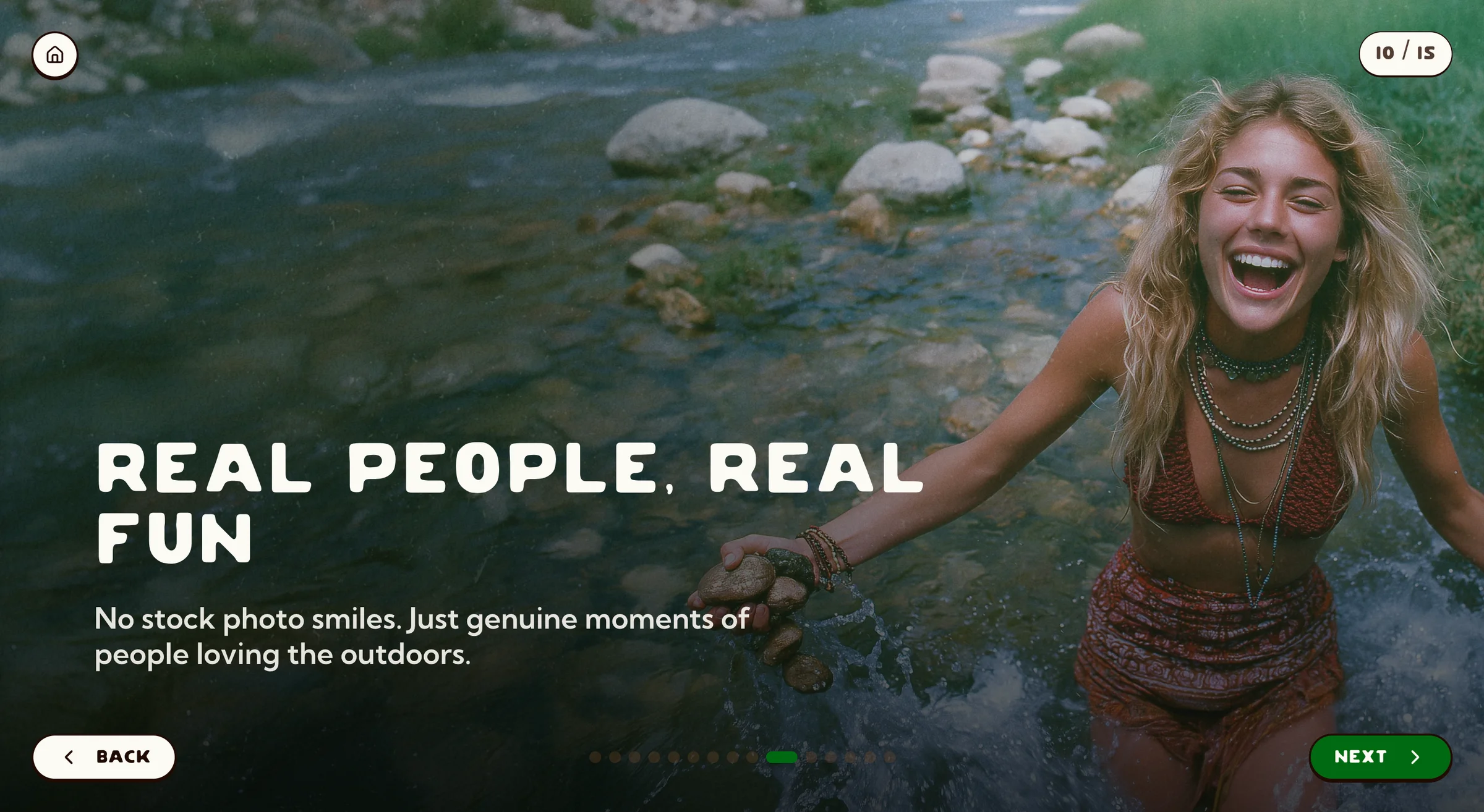
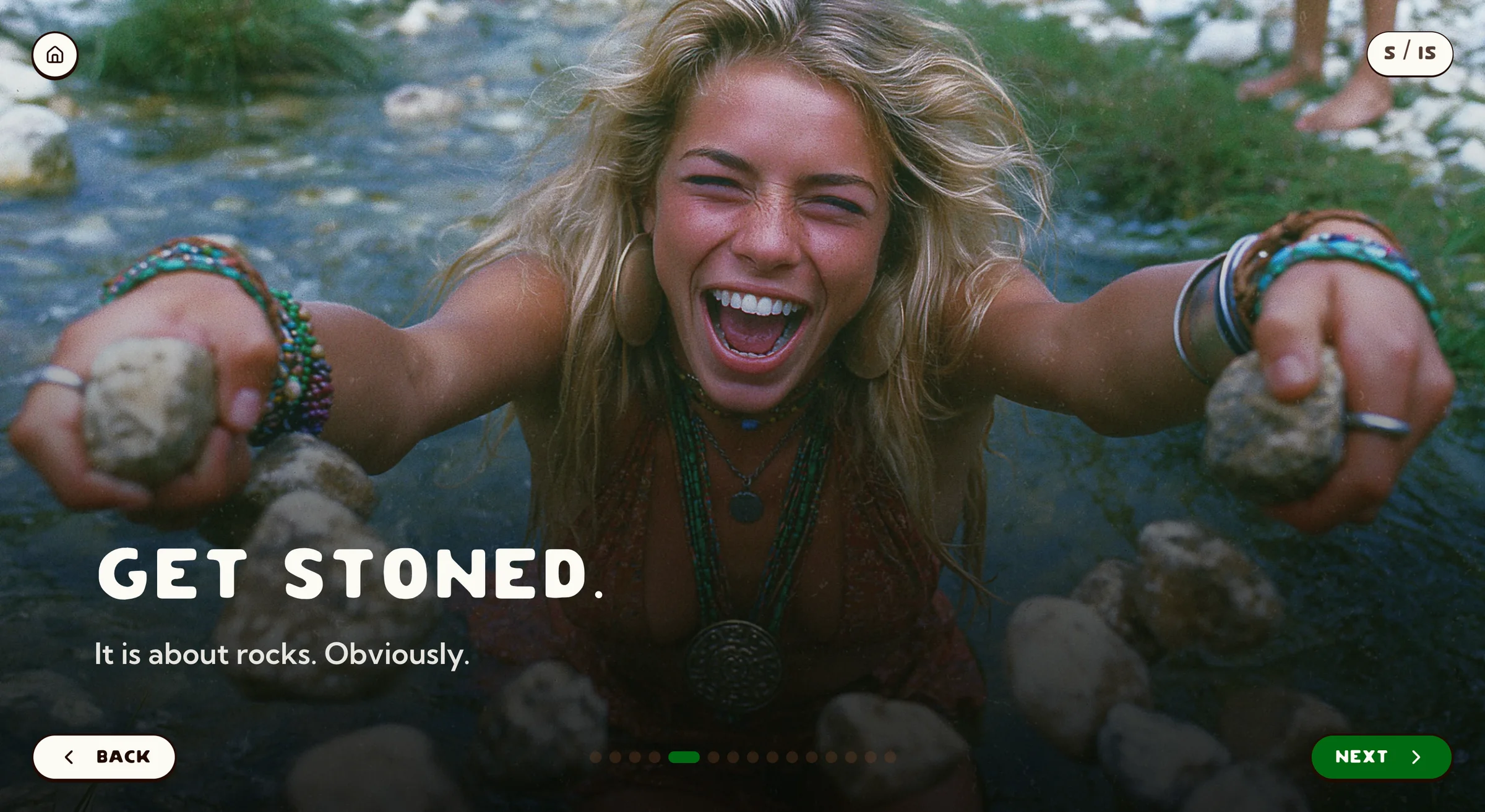
The rest of the imagery follows the same logic: hyperbolic comedy with a soft heart. Headlines like People love our grass a little bit too much (can you blame them?), Our grass will help you sleep, and The best memories are made outside sit over found-family-photo imagery, with Woodstock footage and 90s backyard photos as references, not stock libraries.
The non-negotiable: real people, real yards. No models. No stock. If we can't show actual humans doing actual life on actual grass, we don't make the image.
One brand, two product lines
Ryan also runs wesellgravel.com. The brand had to flex between grass and stone without becoming two companies. Same homepage shell, same typography, same emotional core: swap imagery and a few phrases and it presents cleanly as a stone-centric page. One brand, two storefronts, same Front Yard Family.
Calls to action that don't fight the bit
Leading with personality risks confusing the customer about what's being sold. So the comedy and nostalgia hold the top, but every section has a clear path: Get a quote. Shop sod. Order gravel. Are you a contractor? Click here.
The contractor track came directly out of feedback: pros and homeowners need different pricing, conversation, and proof. A dedicated CTA routes B2B traffic to its own page; the front door stays focused on the homeowner buying with her heart.
What it became
The deliverable set:
- Brand guidelines for voice, imagery, color, type, and logo usage
- Logo system: one cleaned-up primary, three context-specific alternates
- Two-face typography (Costa / Kumbh Sans)
- Extended color palette supporting the existing red/orange/yellow without competing
- Sodfather portrait softened to fit the warmer brand world
- Imagery direction: Front Yard Family, hyperbolic-but-warm, real people only
- Homepage mockup: personality on top, clear CTAs and a contractor track underneath
- Slogan inventory: Two to three inches is deep enough officially absorbed, because we don't waste a good line
The deeper thing the project delivered isn't on that list. We built a brand world that captured a father's real conviction and gave his daughter something real to inherit: specific enough she doesn't have to guess at what All Natural is, confident enough that she has something to push against and eventually make her own. That's what a brand should do for a family business. Not freeze the founder in amber. Hand the next owner a tool that already knows who it is.