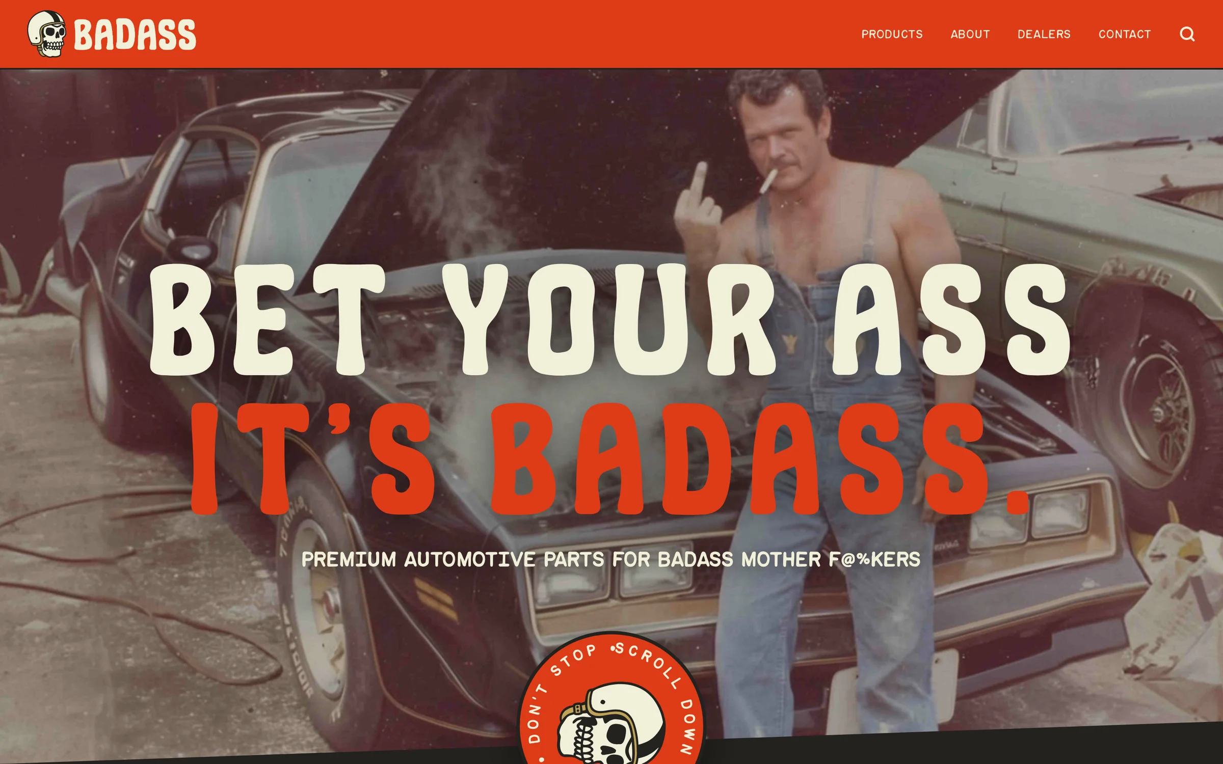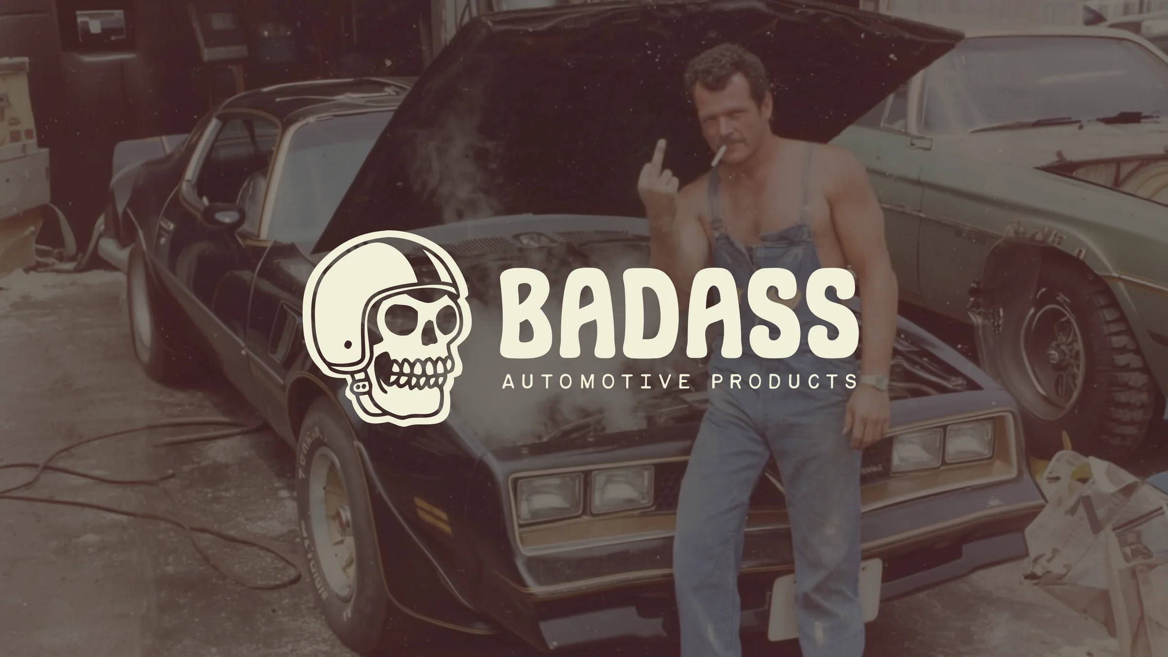
The problem was, the big agency they'd hired first didn't get it. They handed back the word "BADASS" set in a generic sans-serif with a dumb little swoosh underneath and a stack of stock photography. The most expensive way to make a name like that boring. It looked like a thousand other parts brands, except slightly more embarrassed about itself.
I came in through a middleman, so I never got a proper kickoff. The brief was basically: here's the name, make it make sense. So I worked from what I already knew. I know Steven. I know he's a massive Grateful Dead fan. I know his daughter and the way she talks about him. The brand had to come from that, from the actual person who chose the name, not from a moodboard.
BADASS exists as the direct-to-consumer arm of a parent brand called Petra, which serves dealership service centers. So this is the version that has to live on a peg hook next to forty other wiper blade boxes and still get picked up. Faceless and corporate is the default in that aisle. Faceless and corporate was the enemy.
The voice we found
When somebody earnestly calls themselves badass, it's cringe. When your dad, checking out a 15 year old lifted ford ranger with flames painted on it and says "that's BADASS" - it's endearing.
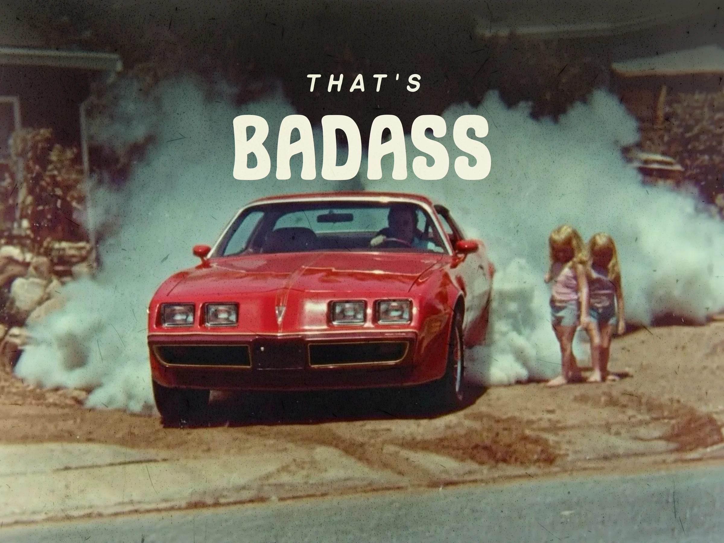
The whole brand is built around the idea of found footage of your parents being way cooler than you. A shoebox of Polaroids from the 70s and 80s: your dad in a denim mechanic suit pouring gasoline on a backyard fire, smoking a cigarette and holding a beer. Your dad in a Firebird peeling out of the driveway with two kids standing five feet from the rear tire. Slightly unsafe. Definitely cool. Definitely not something you would do, because you're on your phone.
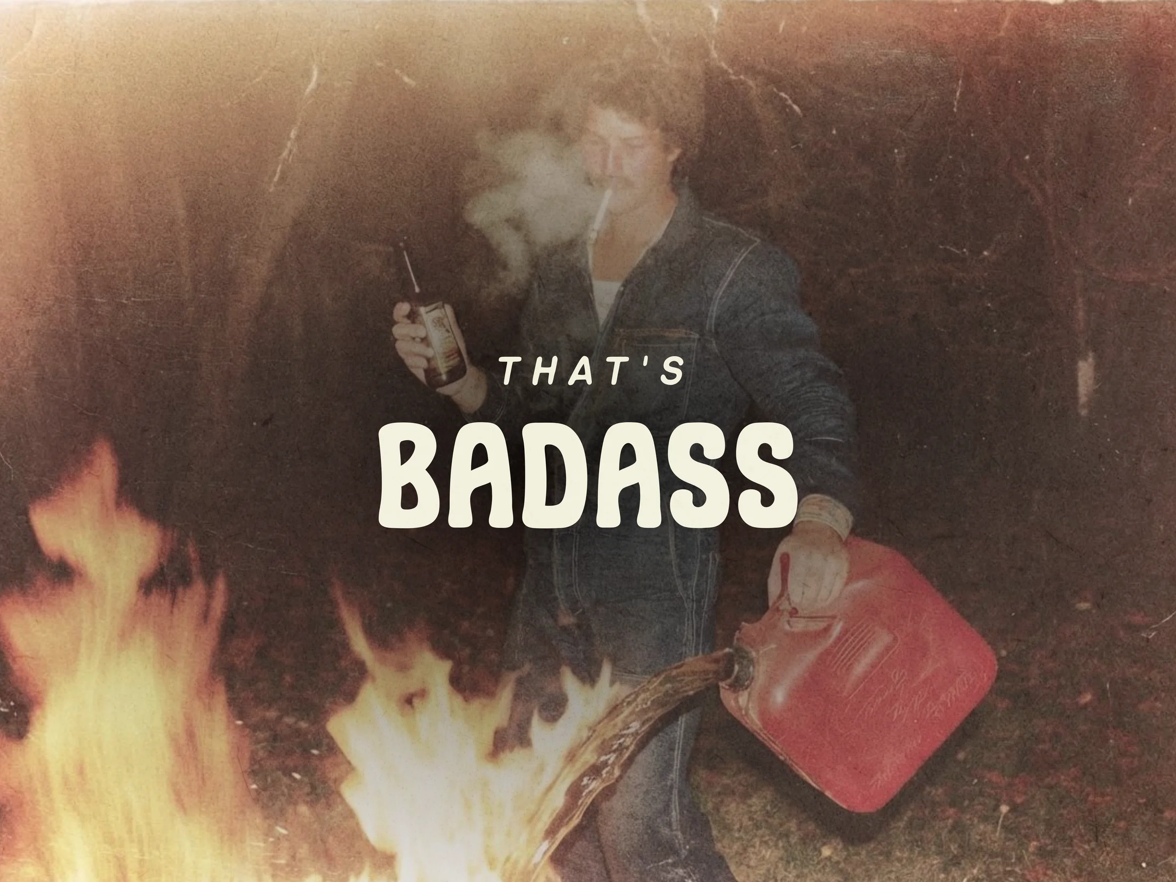
That's the emotional core. It's nostalgia, but a specific kind: the romanticized golden era of the 80s and 90s before there was always a screen between you and the car. It's a little bit Dukes of Hazzard. It's a little bit greaser. It's Steven's Dead-head sensibility filtered through a generation of millennials who look back at their parents and quietly suspect they were having more fun.
The voice doesn't take itself seriously. It's edgy without being mean, dark without being grim, and self-deprecating where it matters, because half the time you're buying parts, it's because you broke something at home and now you have to do the walk of shame to the parts store.
The work
Logo
A skull was always going to be in this, and not just because Steven is a Dead-head. A skull does the biker-gang/greaser badass-ness on autopilot, but the trick was making it playful without making it cute.
So I put the skull in a helmet. That one decision carries most of the weight. A skull in a helmet is a guy who's about to do something he probably shouldn't: build a wooden ramp, jump the car, light a fire, whatever. It's the visual version of that's badass. Cool and dorky at the same time.
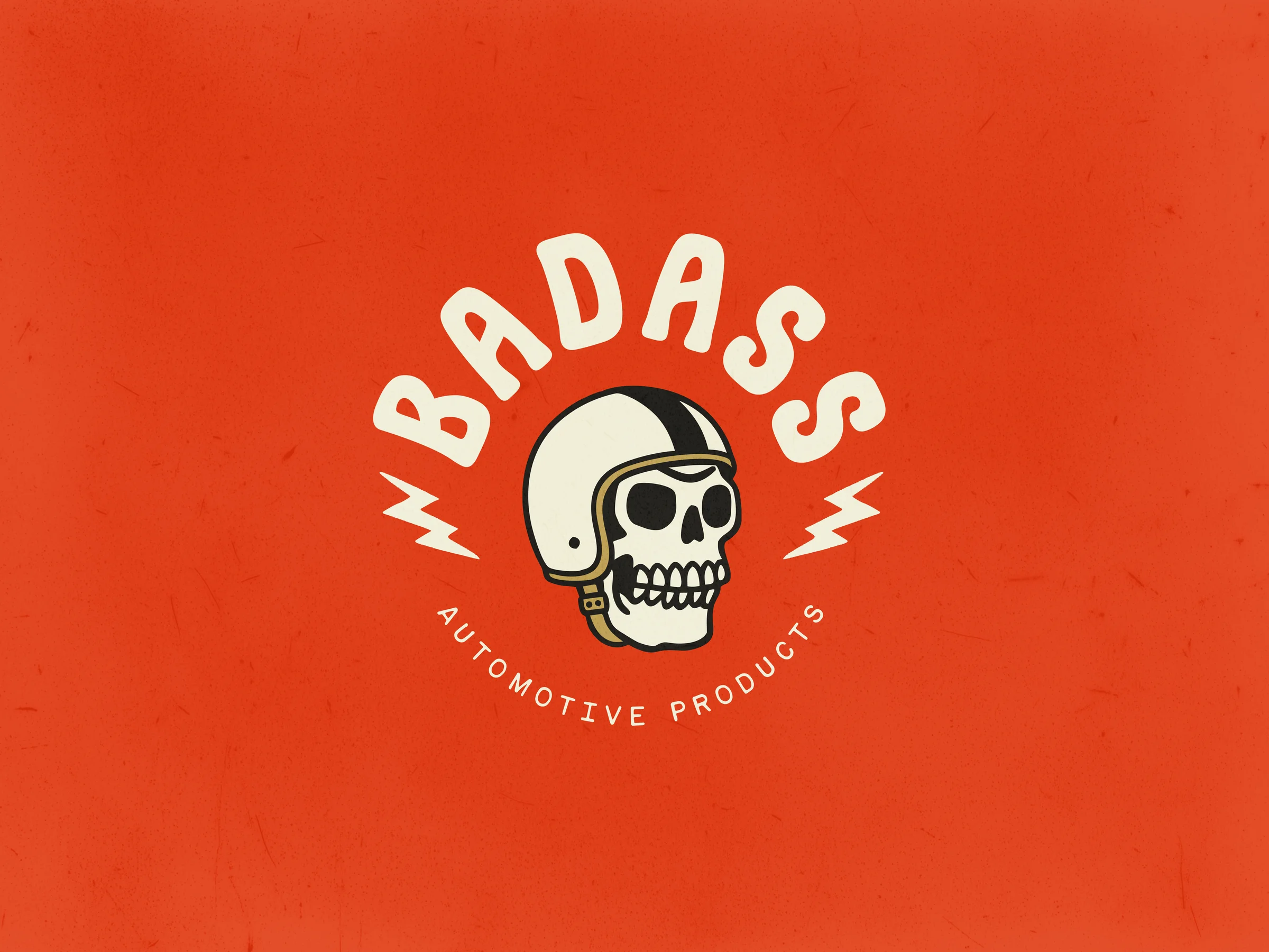
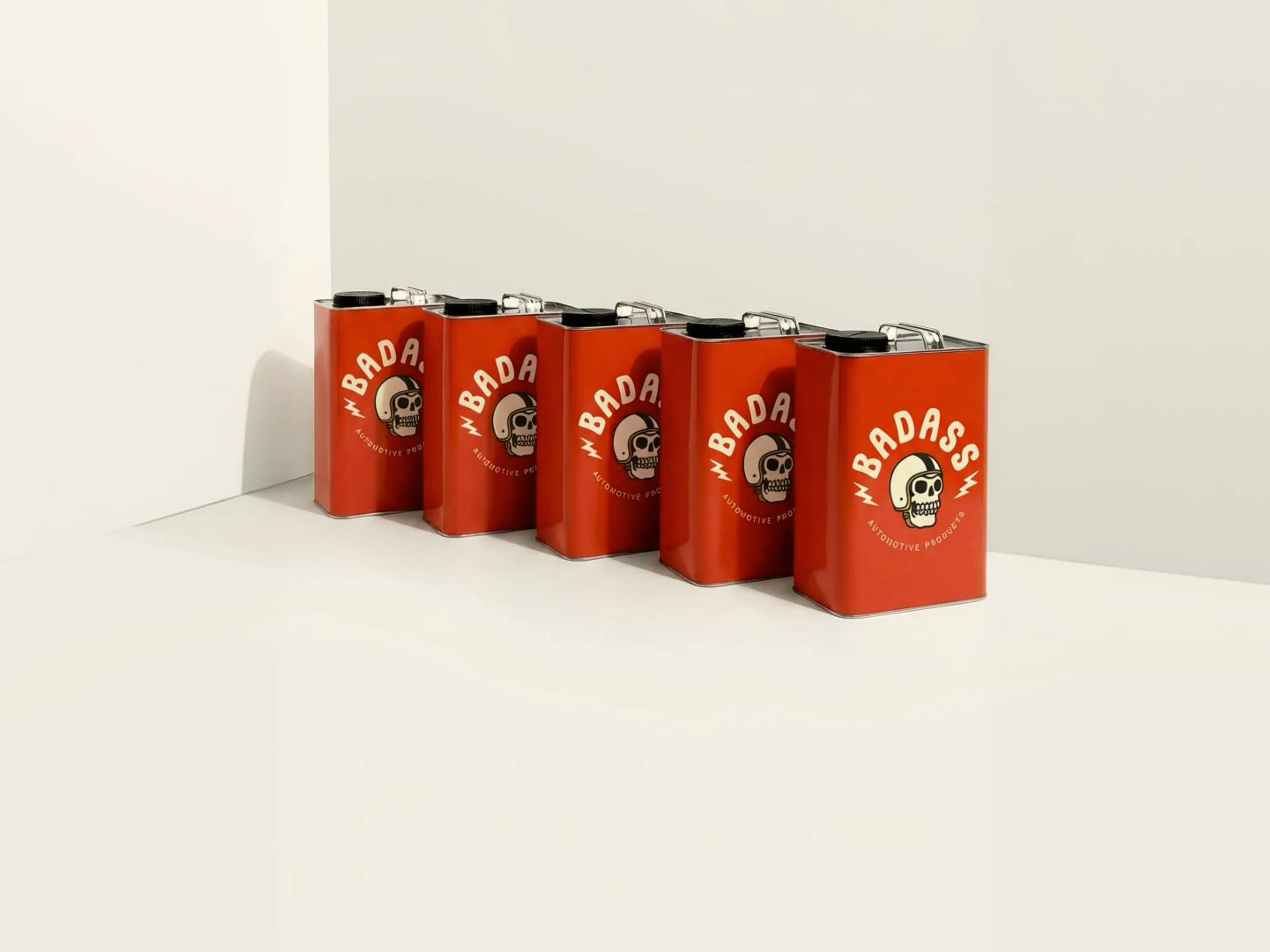
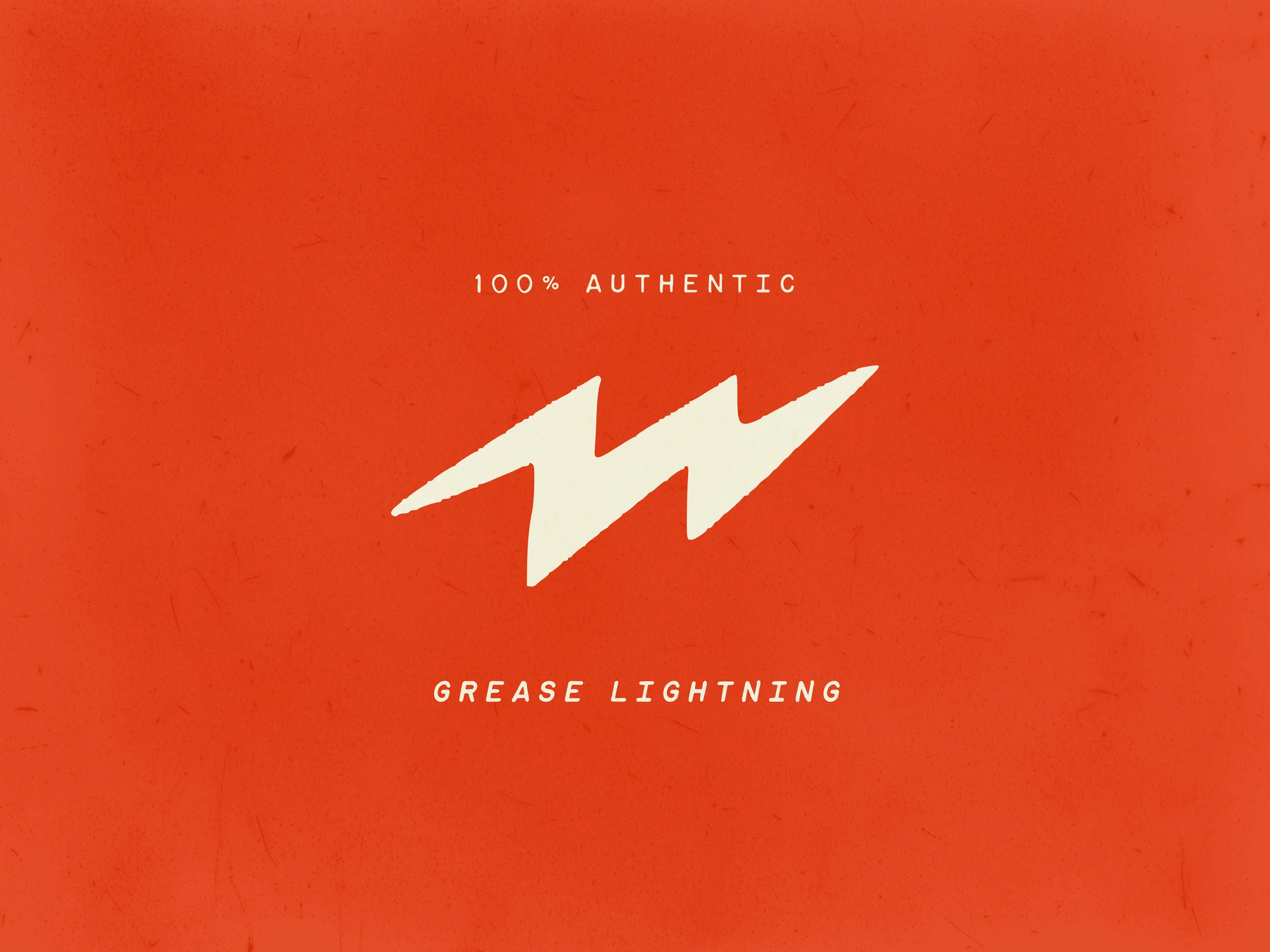
The lightning bolts came next, and they earn their own life inside the system. On the badge they're decoration; off the badge they become a usable shorthand, a way to brand a product when the full skull medallion is too much. The brand guide leans into this with a line I'm still smug about: 100% authentic grease lightning.
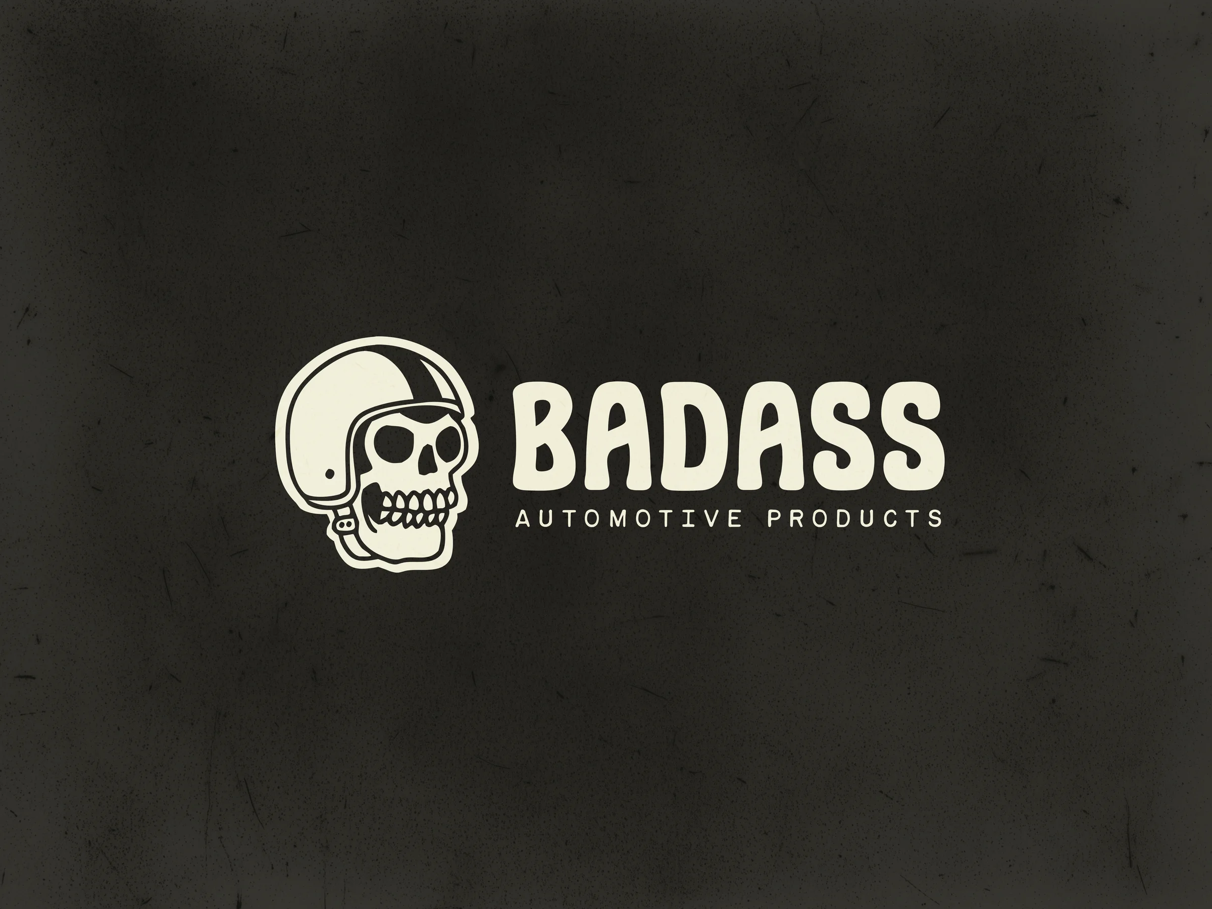
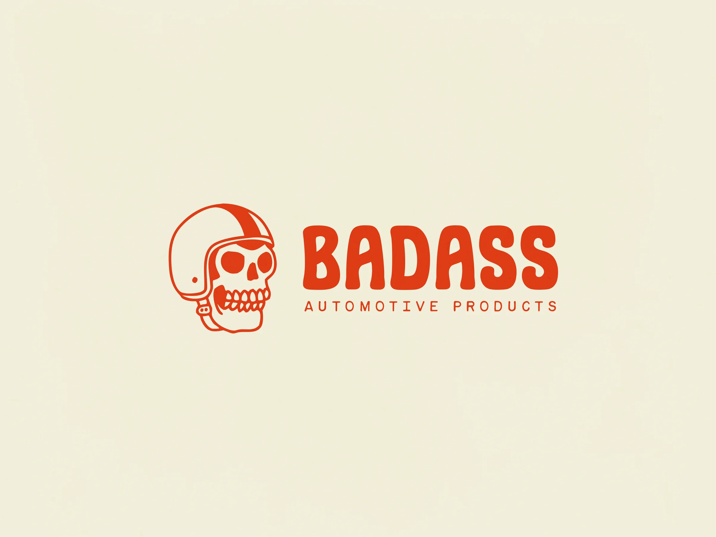
Three logo lockups exist:
- Full color medallion badge (the hero)
- Horizontal lockup on light background
- Horizontal lockup on dark background
The dark-background version isn't just an inverted color swap. White marks on dark have a different optical weight than black marks on white, and if you don't compensate, they look heavy and wrong. So the dark version is treated a little differently. Nerd stuff, but it's the difference between a logo that looks right everywhere and one that only looks right in the file you exported it from.
Color
Red had to be the color. You think about cars, you think hot rod red. But I didn't want a pure, hot, primary red. That reads as alert and corporate. I wanted tomato red. A punchy, slightly nostalgic, slightly off red, the kind you'd see on a Stanley Kubrick title card or a John Carpenter Halloween poster from before the technology of film could hold a clean true red. It's a red that already feels like a memory.
Then I built around it with restraint:
- Off-white for bone (pure white is for amateurs)
- Off-black for text (the kind of black that prints on paper, not the kind that prints on a monitor)
- Desaturated primaries (blood, navy, and brass) as supports
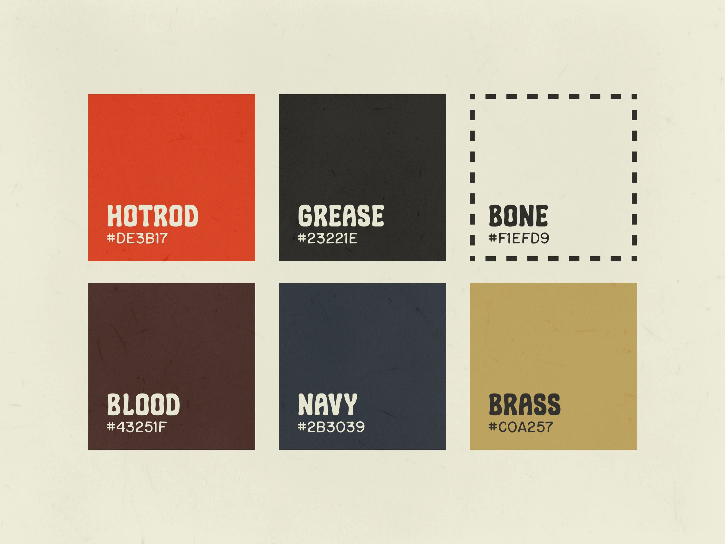
Pure black and pure white are for design students. Off versions feel inhabited. They feel like something that's been around for a while, which is exactly the energy a brand built on nostalgia needs.
Typography & voice slugs
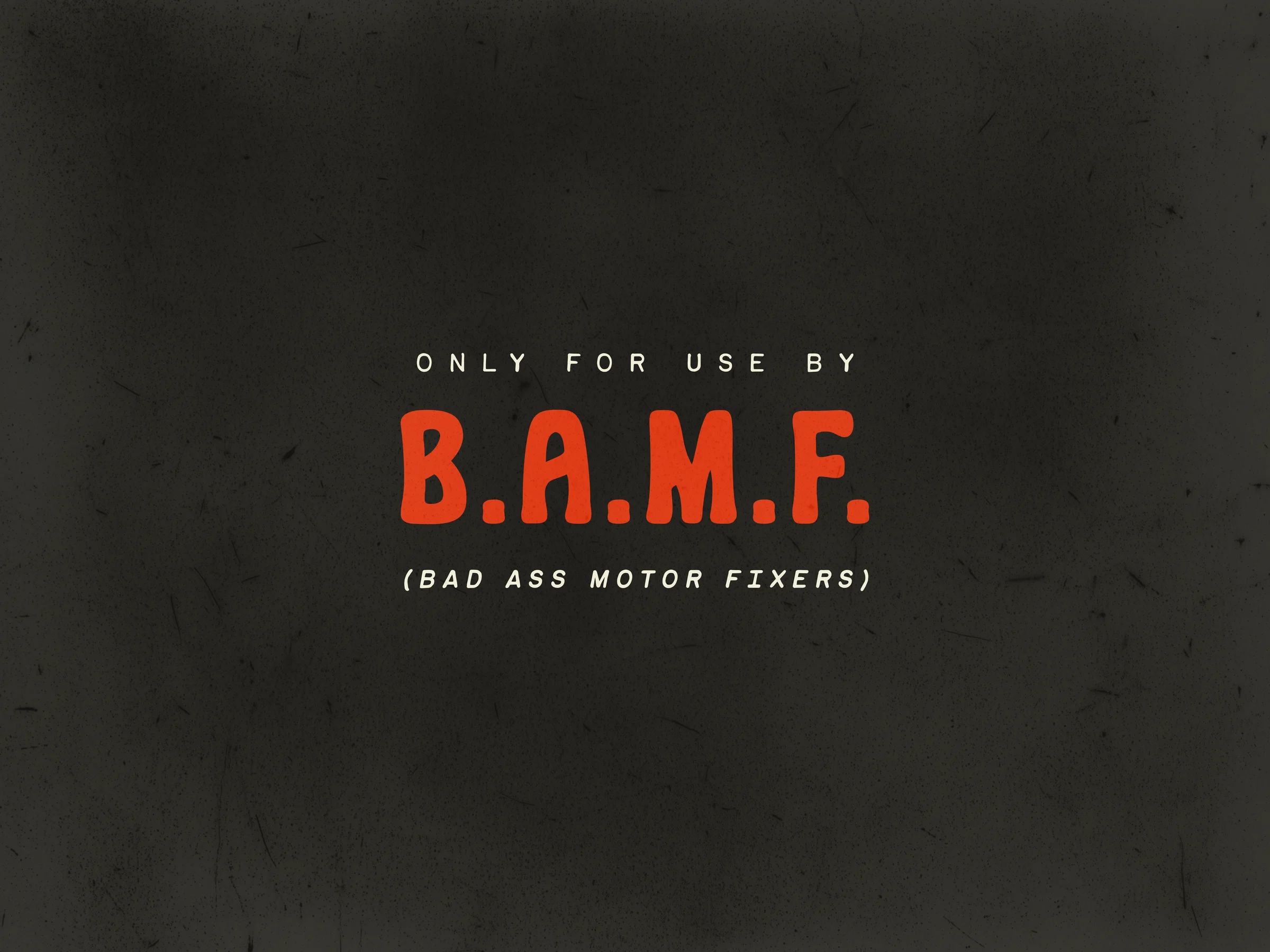
The brand guidelines lean into voice through small typographic moments rather than long manifestos. A patch reads Only for use by B.A.M.F. with a parenthetical underneath: Bad Ass Motor Fixers. You can picture the exact dad who would wear that on a shirt. He's the customer.
Imagery
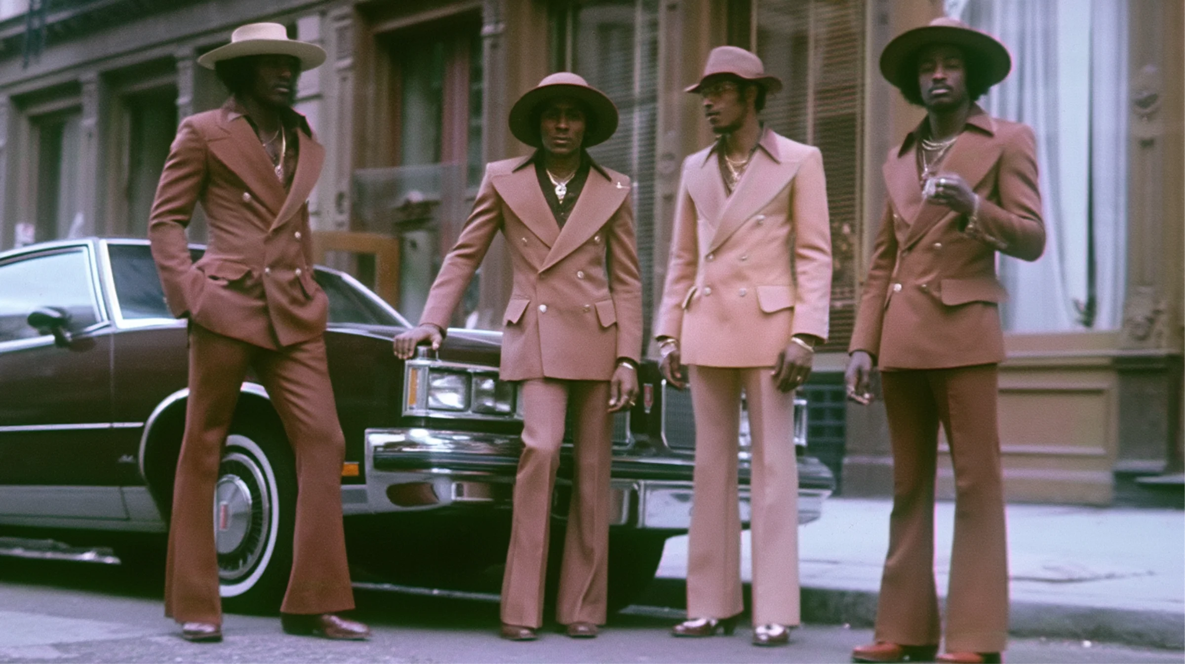
This is where the brand stops being a logo and starts being a world.
No stock photography. No models. Every image looks like it was pulled out of a shoebox in someone's attic. The hero shot is a mustachioed dad in overalls, no t-shirt, smoking a cigarette, flipping off the camera, with a smoking muscle car engine behind him. He's clearly broken something. He doesn't care. He's annoyed at his buddy for taking the photo.
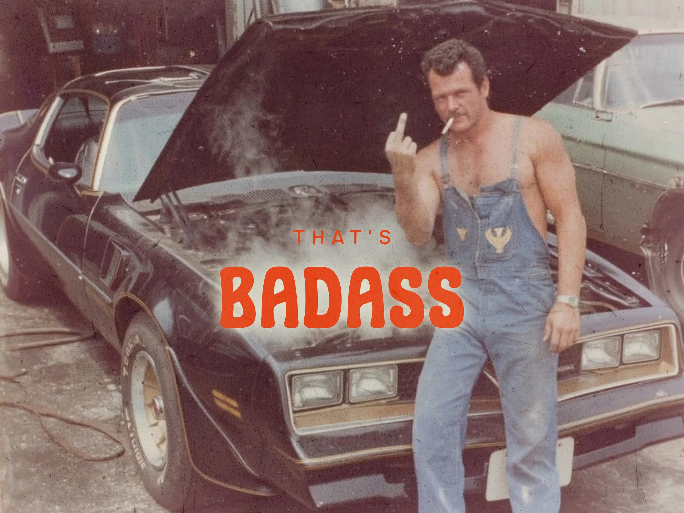
That image does the entire pitch in one frame. It says: we know why you're here. Something broke. You couldn't fix it at home. Now you're standing in front of a wall of parts trying to figure out which box has the thing that will let you finish the day. It's relatable in a way the entire aisle is not.
What it became
I leaned hard on a short list of references:
- The Grateful Dead: the obvious one. Skulls, irreverence, joy, a community that recognizes its own visual shorthand instantly.
- Liquid Death: the gold standard for taking a boring category (water, in their case) and giving it teeth without being mean about it.
- Vintage Texaco motor oil cans: Americana, hand-painted, the visual grammar of the era before everything went grayscale corporate.
- Milwaukee Tools: the lightning bolt cue, and proof that a hardware brand can be unapologetically loud and still earn shelf space.
The full system covers:
- Three logo lockups (medallion, horizontal light, horizontal dark)
- Standalone lightning bolt mark for product application
- Skull mark for product application
- Color palette with off-white/off-black foundation and tomato-red lead
- Voice slugs (100% authentic grease lightning, B.A.M.F.)
- A library of voice-defining imagery, plus direction for generating more
- Homepage UI mockups carrying the system into product
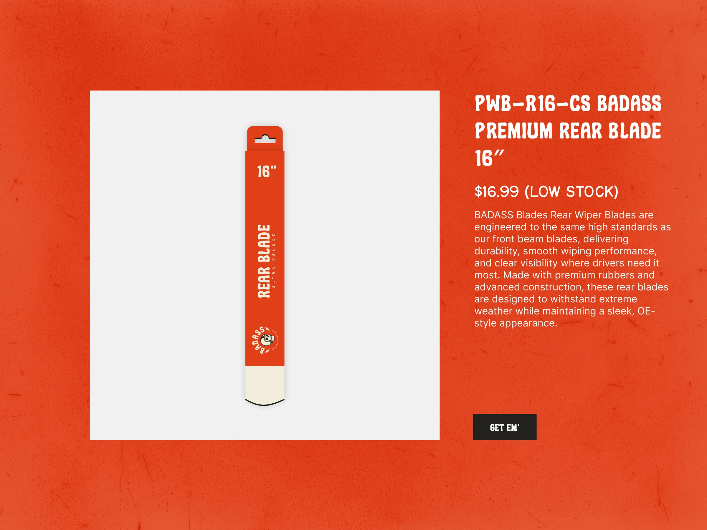
The client signed off with no notes and immediately retained me to design the packaging. That's the moment you want: when the brand snaps so cleanly into the founder's head that they can already see it on the shelf.