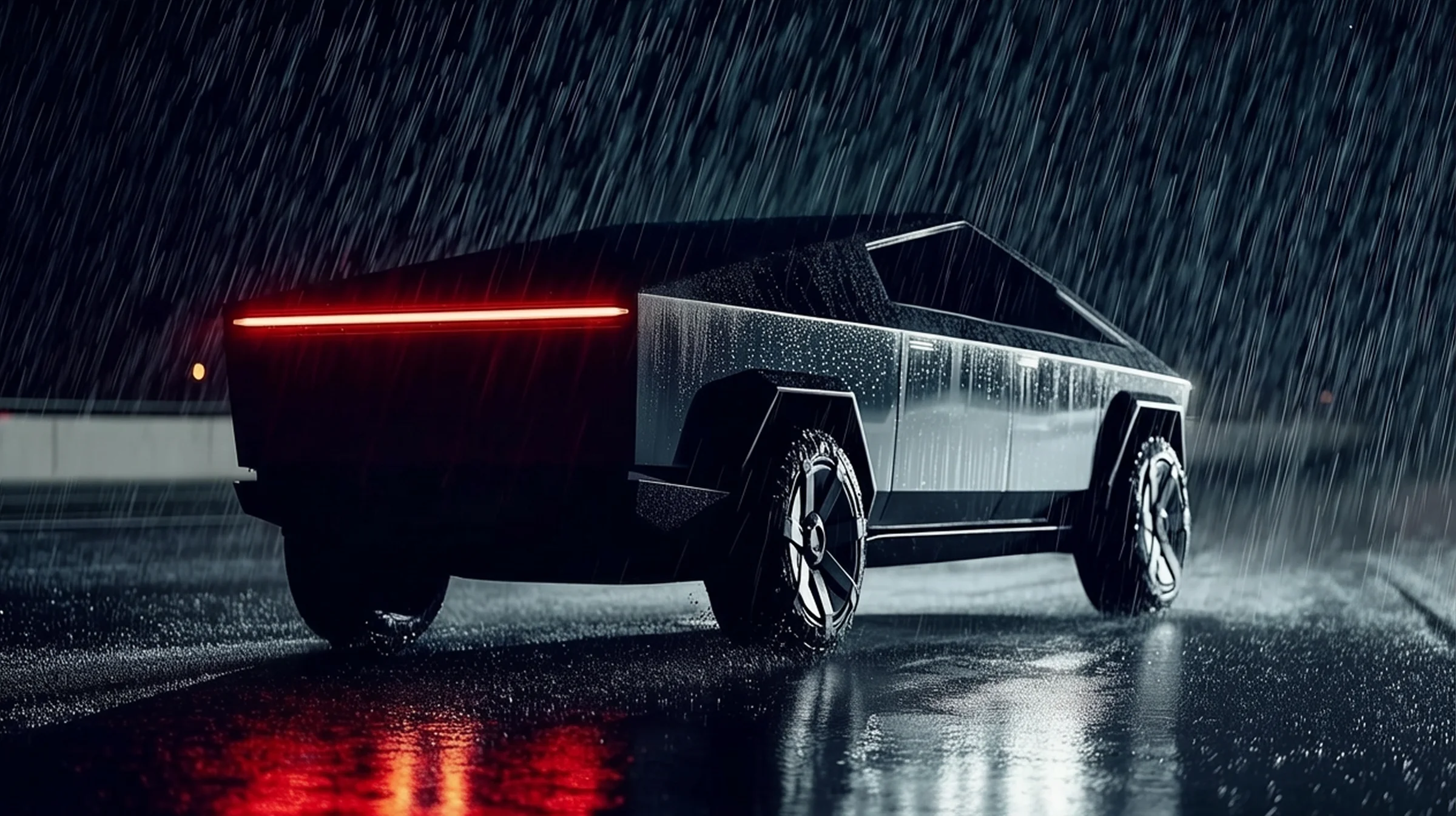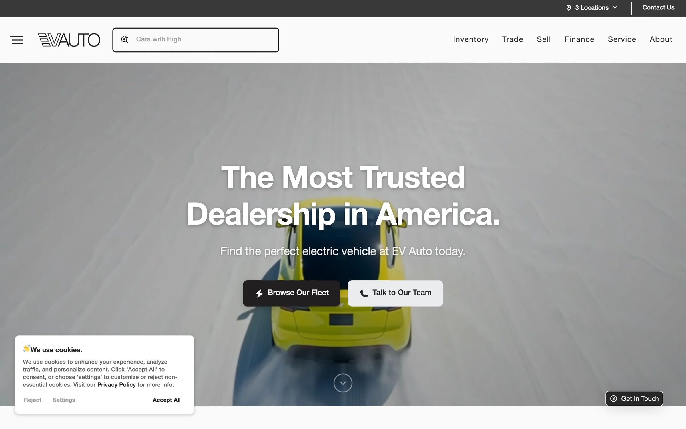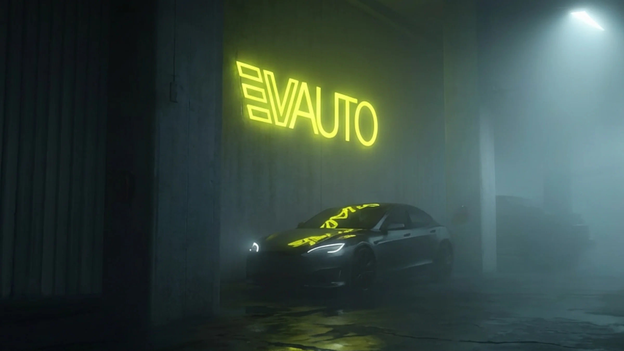
EV Auto is one of the few outfits that actually has its act together. Three locations (Bountiful and Lehi in Utah, Brentwood in Tennessee) focused on premier pre-owned EVs. Tesla-heavy inventory. Real service operations attached to the showrooms. The product is good. The problem the brand needed to solve wasn't the product. It was the category noise around it.
So the strategic call was counter-intuitive on its face: be deliberately understated.
Not understated in the sense of forgettable. Understated in the sense of calm. In a category where everyone else is yelling, the most differentiated thing you can do is stop yelling. Used-EV buyers are anxious, doing more homework than they would on a comparable ICE car, looking for any signal that the company on the other end of the transaction is the adult in the room. Trust is the positioning. Restraint is the design system.
The voice we found
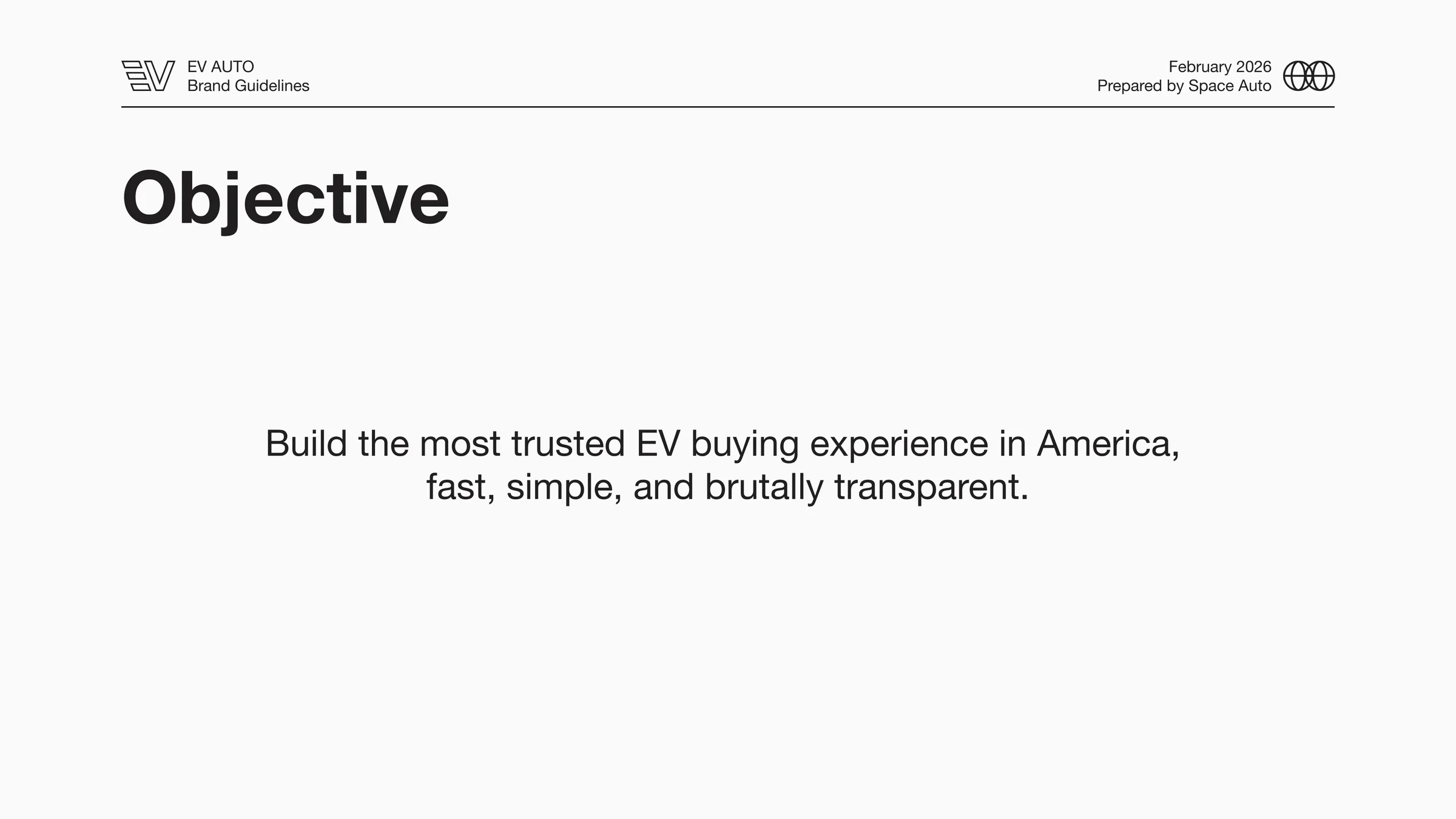
The mission statement on page 2 of the guide is the thesis in one sentence:
Build the most trusted EV buying experience in America: fast, simple, and brutally transparent.
Everything downstream is in service of that. The guide formalizes it with four principles that read more like an operations manifesto than a marketing one:
- Performance: Speed feels like trust. No waiting, no friction, no clutter.
- Confidence: No hype. Just calm, premium, and never salesy.
- Human: Alex Lawrance's voice, team's integrity, not corporate.
- Transparency: Honesty wins. Show the good, the bad, and the ugly.
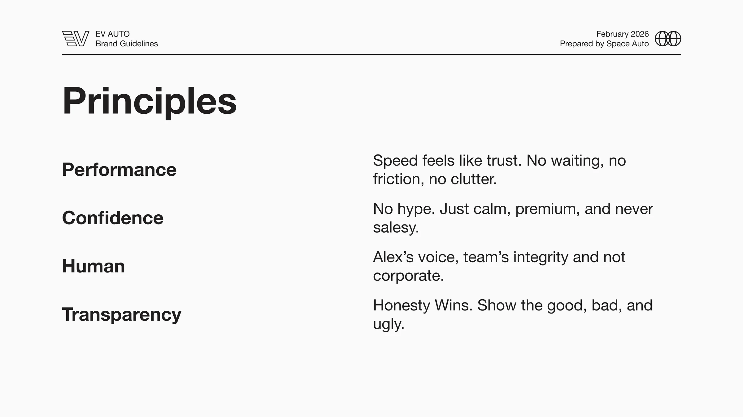
That third bullet names the founder on purpose. The brand isn't an anonymous storefront. It's Alex's company, and the guide treats his voice as a load-bearing asset of the system.
The last bullet is the other load-bearing one. Show the good, the bad, and the ugly. In a category where the default sales motion is to bury the bad, leading with disclosure is a positioning move. It's also a moat: hard to fake, and once a buyer sees it, every competitor that doesn't do it looks like they're hiding something.
The voice direction follows from there:
We talk like someone who actually owns the outcome.
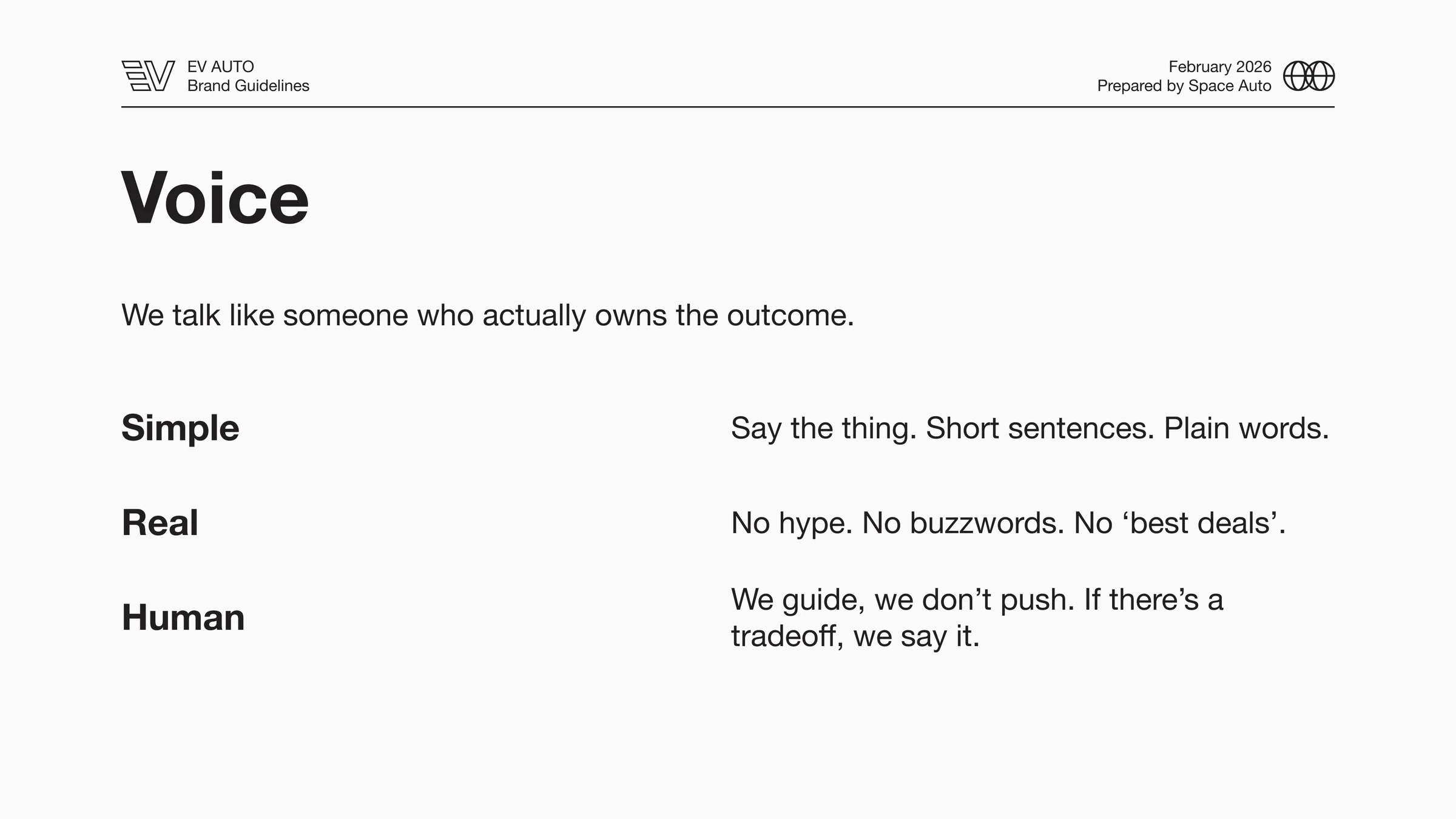
Three modes. Simple: say the thing, short sentences, plain words. Real: no hype, no buzzwords. Human: we guide, we don't push. If there's a tradeoff, we say it.
If you've ever bought a used car, you know how rare that voice is. That's the point.
The work
Positioning: premium + function, deliberately not Tesla
The guide includes a perceptual map worth taking seriously: a 2x2 with Premium ↔ Value vertical and Form ↔ Function horizontal. Porsche top-left (premium / form). Polestar nearby. Tesla center-right (premium / function). Carvana bottom-right (value / function).
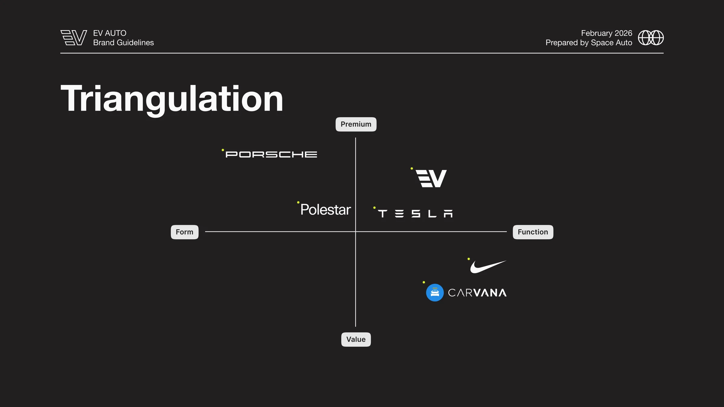
EV Auto is plotted in the top-right quadrant (premium and function) and notably positioned above Tesla on the premium axis. That's a deliberate flex: we're not Carvana, we're not the value play. We're not Tesla, we're not selling a lifestyle bet. We're the trusted, premium adult layer between you and the car you're trying to buy.
That positioning informs everything that comes after: the white space, the typography, the photography, the absence of stunt marketing.
Typography: clarity as a brand value
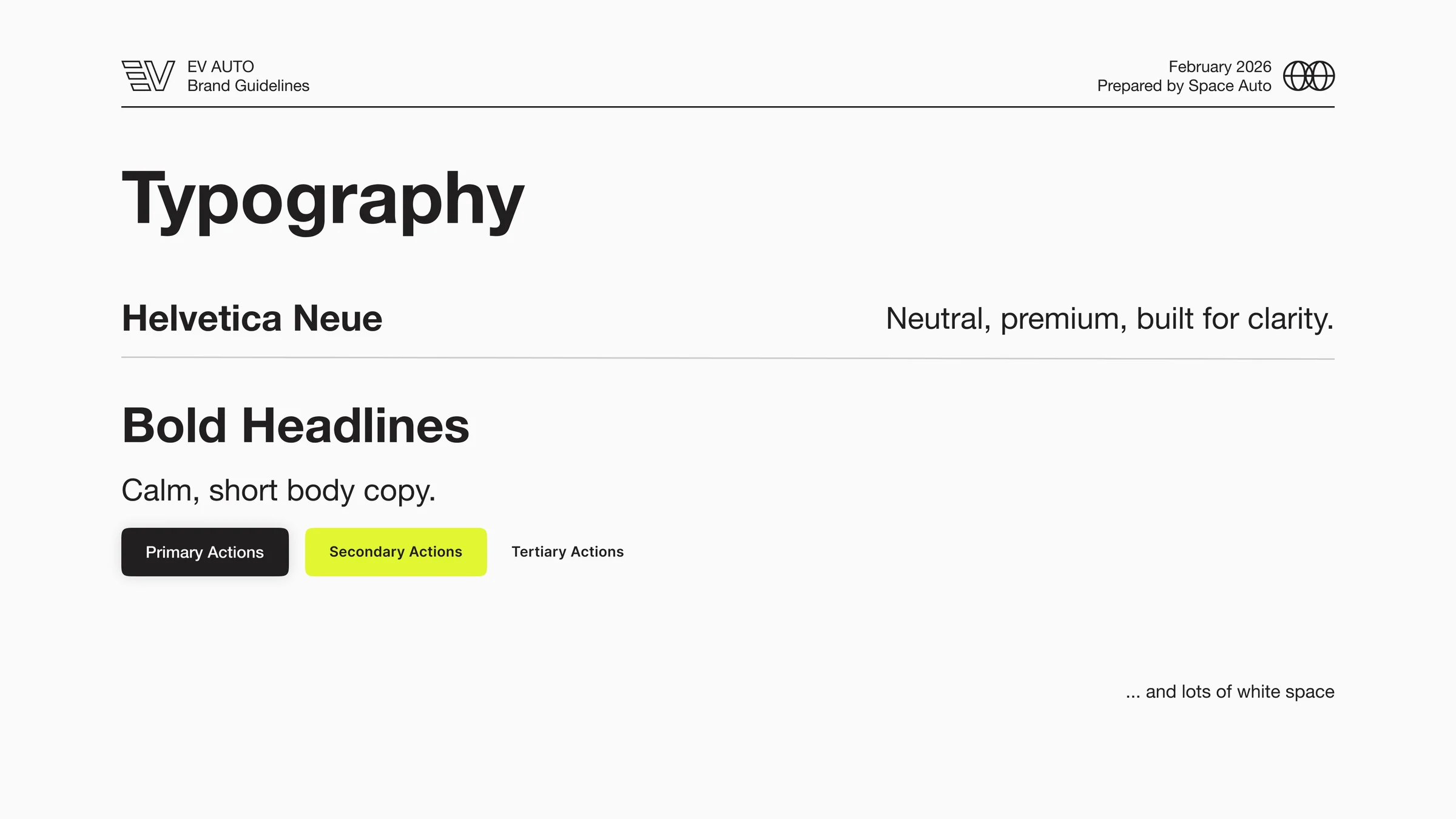
Helvetica Neue. Used unapologetically. Bold headlines, regular body, generous tracking and leading. Sized like the brand has nothing to prove:
- H1: 64pt Bold
- H2: 48pt Bold
- H3: 24pt Medium
- Paragraph: 16pt Regular
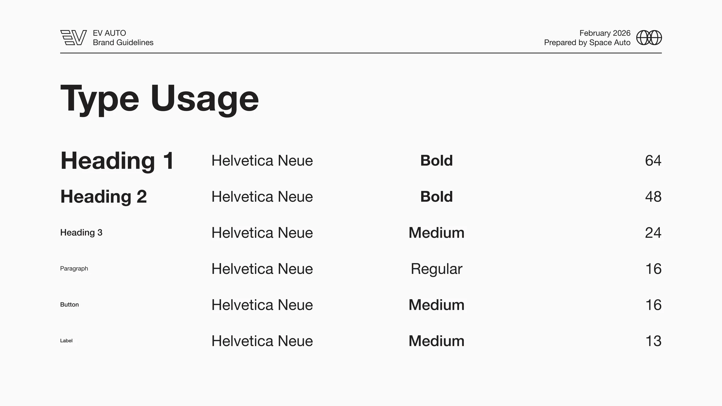
The guide describes it in one line: Neutral, premium, built for clarity. In a category where competitors use four typefaces in two weights with starburst badges, plain Helvetica reads as authority. We don't need typographic theatrics, because the product speaks.
Color: restraint with one electric exception
The palette is six colors, four of which are technically neutrals:
- Jet Stream (#FBFAFA): primary canvas, "big white space, zero noise"
- Midnight (#211F1F): primary text, "clean, high-contrast, serious"
- London Fog (#E6E6E6): soft surface for cards and panels
- Cement (#CBCBCB): borders and dividers
- Asphalt (#3A3939): secondary dark, subtext, icons
- Citron (#E0F634): electric accent, "use sparingly for pops of color"
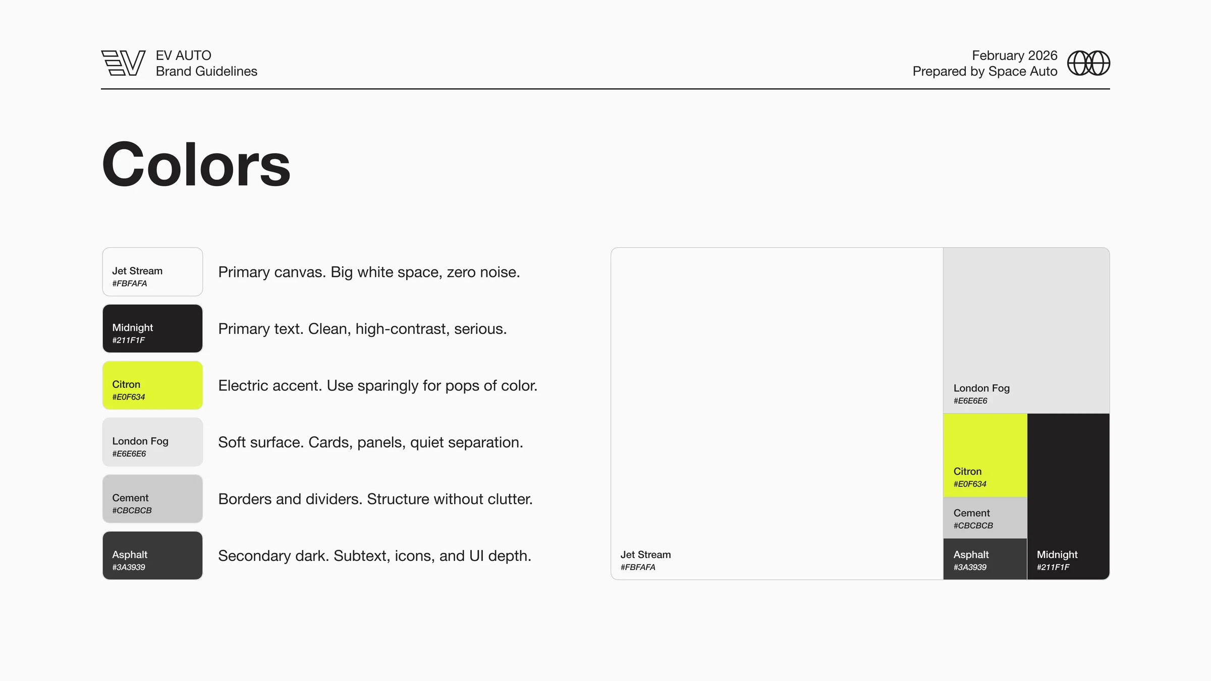
That last color is the entire brand's release valve. Citron is loud: an electric chartreuse that looks like a high-voltage warning label. The rule is that it never carries primary information; it shows up in CTAs, accents, and a few hero moments where the brand is allowed to remind you it sells electric vehicles. Used everywhere, it's a gimmick. Used once per page, it's the brand. White is the dominant surface; Citron is a sliver. That ratio holds across the whole system.
Logo: anchored, not redesigned
The primary mark is an "EV" monogram: horizontal bars forming an E that flow into a V. The brand guide treats it the way Nike treats the swoosh:
This mark is the parent. Treat it like the Nike swoosh. Use it alone when possible, or use it as the anchor for sub-brands.
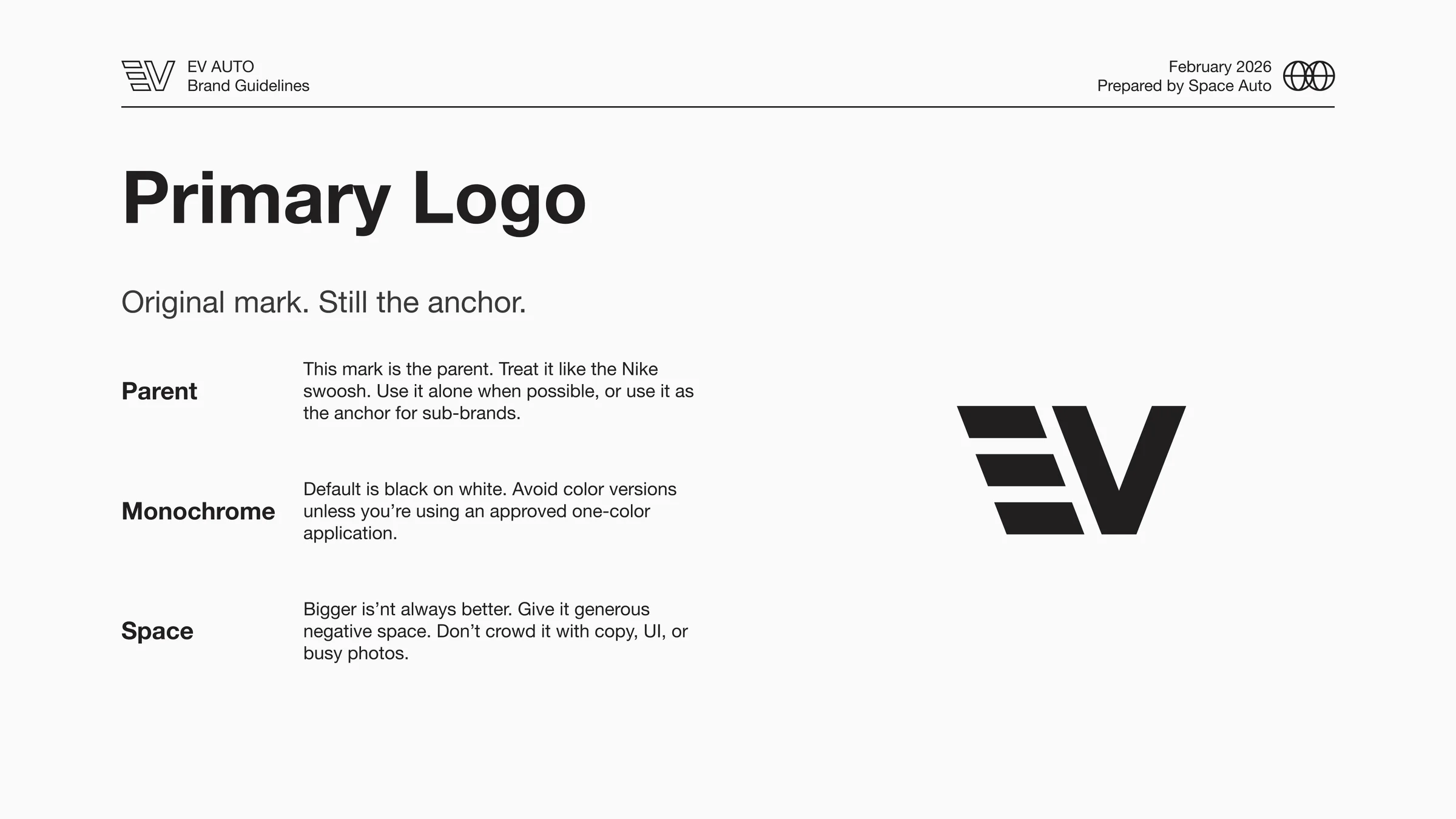
Default treatment is black on white, monochrome. Color versions are restricted. Negative space is non-negotiable: bigger isn't always better. Don't crowd it with copy, UI, or busy photos.
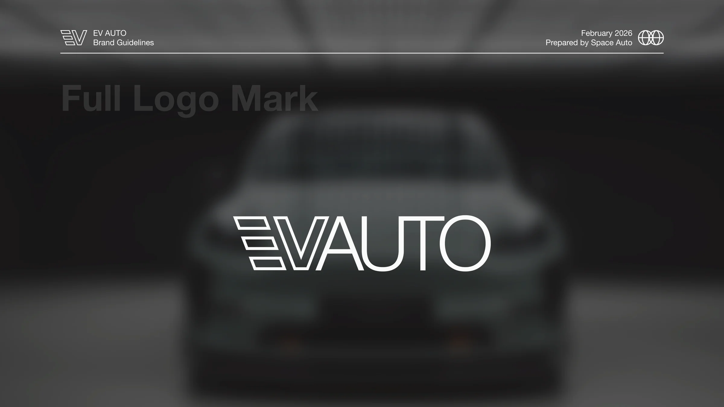
The full lockup pairs the monogram with an "AUTO" wordmark in a light geometric sans. Clean, calm, no swooshes, no chrome, no italics, no electricity-bolt cheats. The logo does the same job the typography is doing: telegraphing that the company on the other end of the URL isn't going to waste your time.
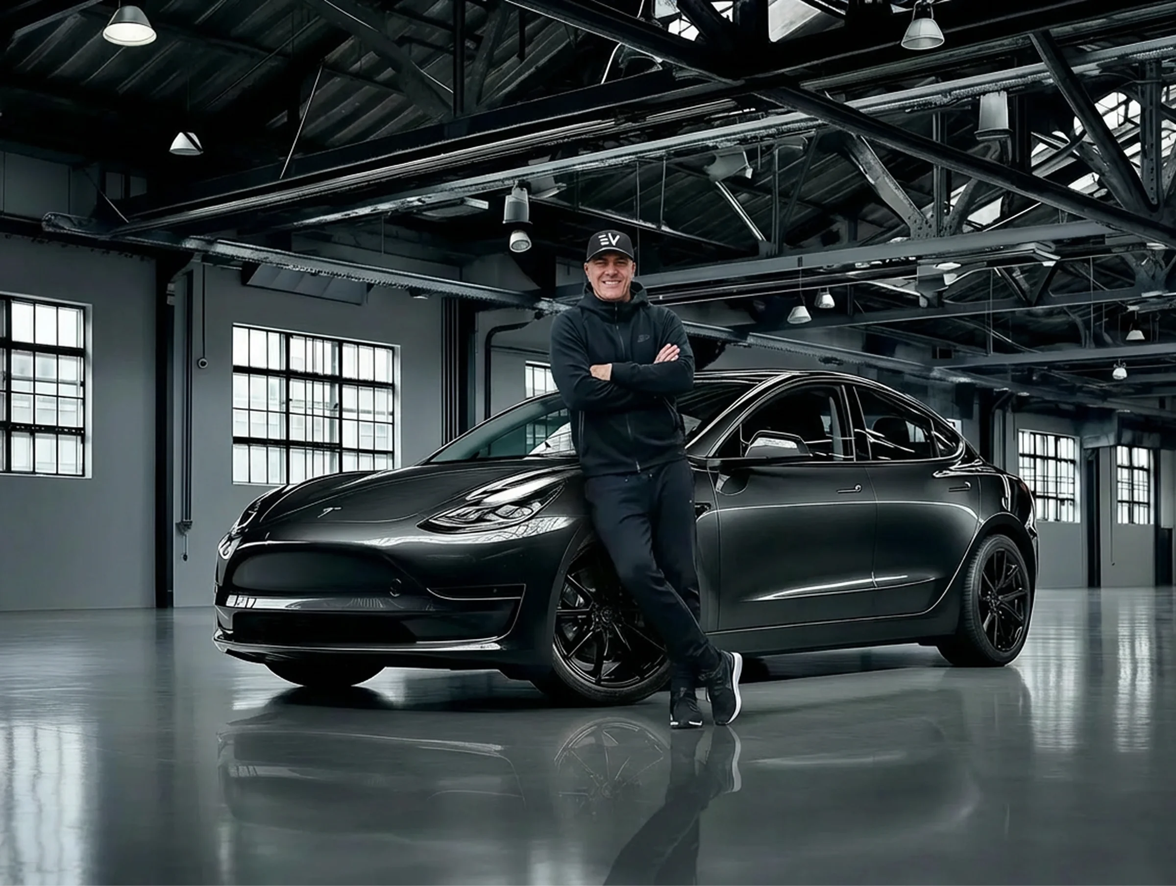
Photography: make it look expensive, but feel real
The single best line in the imagery section, and it's the entire photography thesis. Three explicit modes:
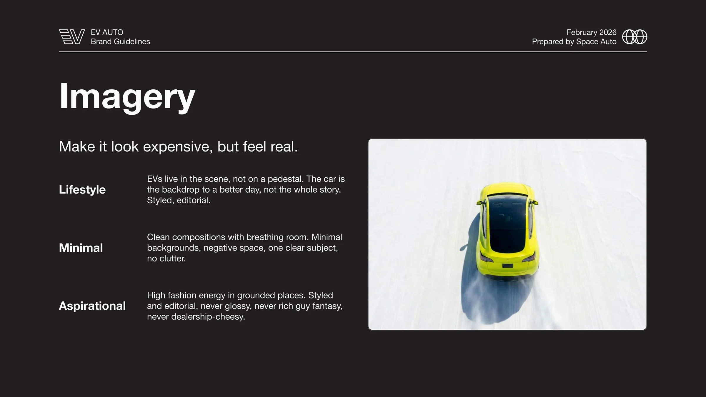
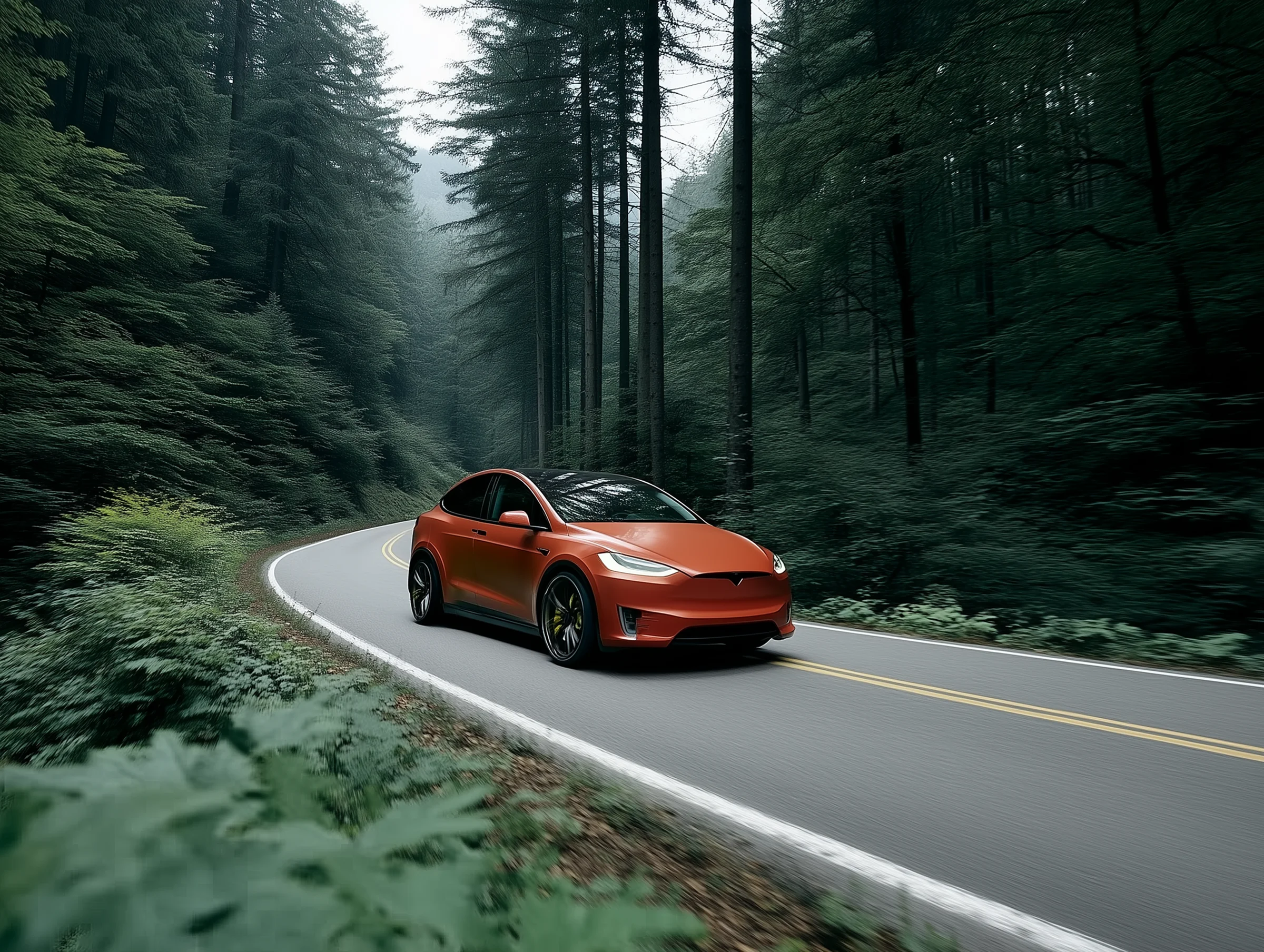
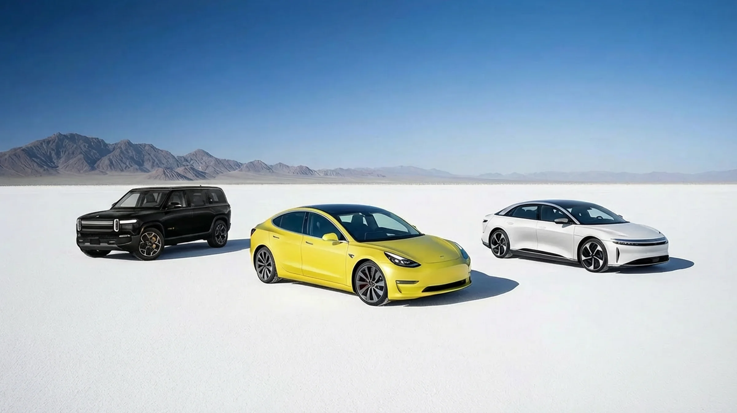
- Lifestyle: EVs live in the scene, not on a pedestal. The car is the backdrop to a better day, not the whole story. Styled, editorial.
- Minimal: Clean compositions with breathing room. Minimal backgrounds, negative space, one clear subject, no clutter.
- Aspirational: High fashion energy in grounded places. Styled and editorial, never glossy, never rich-guy fantasy, never dealership-cheesy.
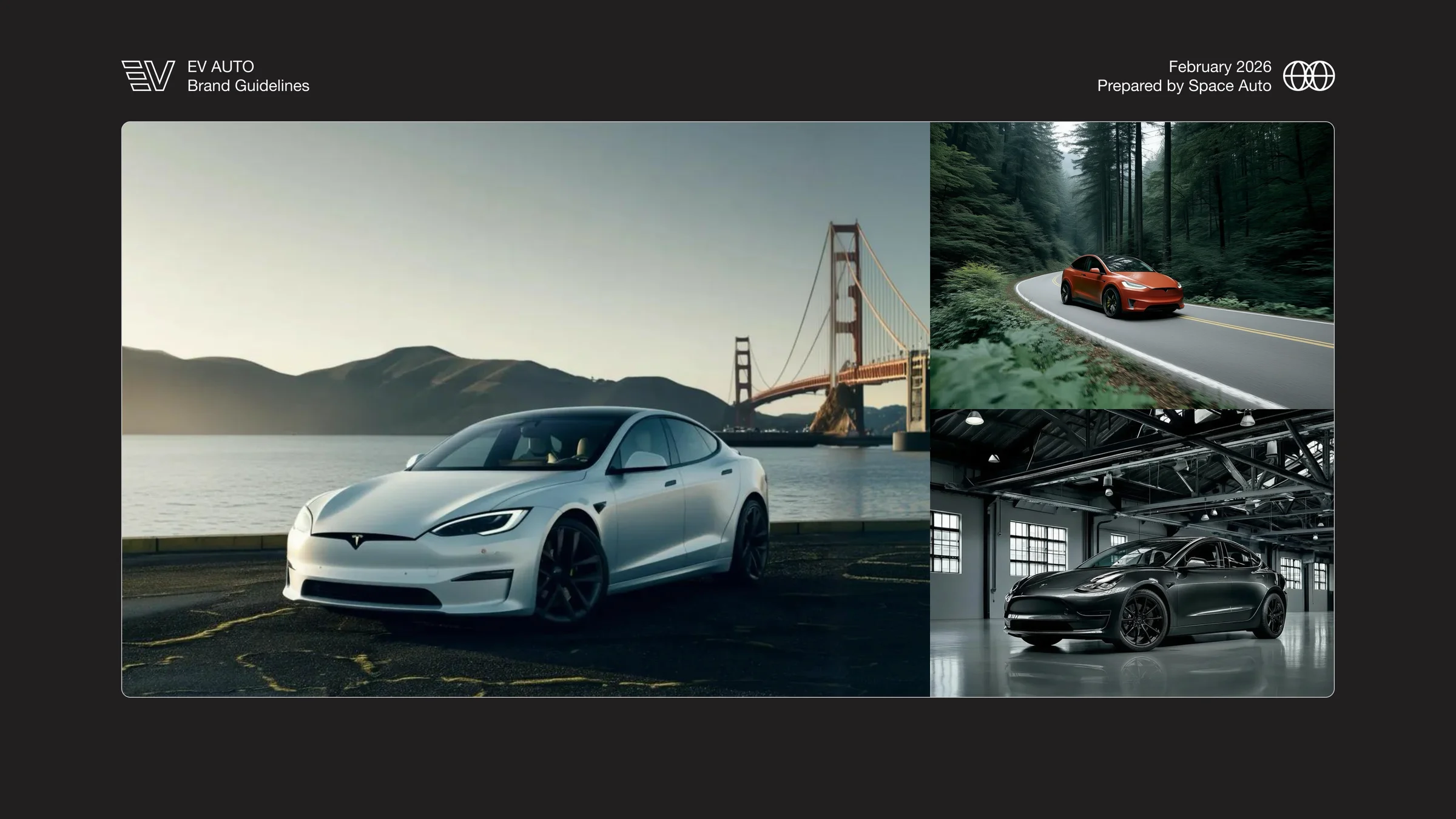
Note what's being ruled out. Never glossy. Never rich-guy fantasy. Never dealership-cheesy. That's the entire competitive set named and rejected in three negatives. The reference board lands at editorial: car photography that thinks it's selling architecture, fashion, or travel, never used cars.
That's the move. The whole brand is dressed for a different category than the one it competes in.
What it became
The full delivered system:
- Mission statement and four-principle manifesto anchoring every downstream decision
- Voice framework: Simple / Real / Human, with rules strong enough to actually constrain copy
- Competitive positioning map placing EV Auto in the premium-function quadrant above Tesla
- Color system: six colors led by a near-white canvas, with Citron as the single electric accent
- Typography system: Helvetica Neue with six clearly-roled styles
- Primary monogram + full lockup with anchored usage rules and generous negative space
- Photography direction: Lifestyle / Minimal / Aspirational, with explicit exclusions
- Site mock establishing the surface treatment, layout density, and Citron usage discipline
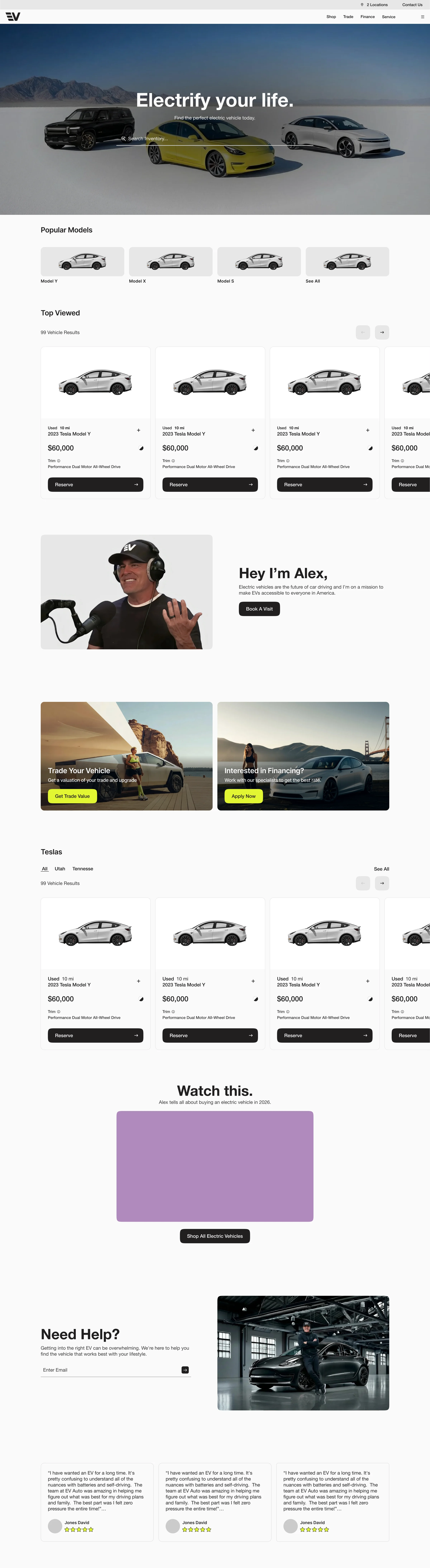
- Production site carrying the system across three locations (Bountiful, Lehi, Brentwood) and a real inventory operation
The insight worth holding onto: the brand isn't restrained because restraint is in fashion. It's restrained because the category is not, and trust is the only positioning that pays in a market full of noise. The visual quietness is doing competitive work.
By the numbers
Once the redesigned site shipped, the metrics moved. Honest read of a noisy signal:
- Traffic: up 136% YOY, 12% MOM. The cleanest number in the set. Dramatically more humans on the site than a year ago, still climbing.
- Engaged sessions: up 106% YOY, roughly flat MOM. The truer engagement signal: people sticking around to do something. YOY doubling tracks the traffic story; flat MOM is the rate settling after a big jump.
- Conversions: up 75% YOY, with an asterisk we'll name out loud: about 50 of the tagged conversion events don't pass our smell test. Directionally true, not gospel.
- Engagement rate: down 12% YOY and MOM. When raw traffic balloons this hard, the rate gets diluted by definition, and the Podium chat widget muddies this specific metric further. Down 12% on a metric whose denominator more than doubled is not the story it looks like.
Worth naming: the Space Auto team carried this site after launch. The numbers above reflect their hand on the wheel, not just the launch moment.
EV Auto's homepage looks, at a glance, like the home page of a car company that doesn't need you. Which is the most effective way to be a car company that Alex actually wants you to buy from.