The category is dealership technology: CRMs, websites, digital retailing, the tools that move a car from the lot to a customer's driveway. On paper, deeply unsexy. In practice, a catastrophe. The space has been dominated for two decades by a handful of holding companies who acquire smaller vendors and bolt their software onto other already-bolted software, producing what every dealership in America experiences as one continuous nightmare. CRMs that don't work. DMS systems that won't talk to each other. Digital retailing tools designed by people who have clearly never sold a car. And nobody (nobody) has been trying to fix it, because nobody outside the industry cares about car dealers. Everyone hates car dealers. The industry has been left to rot inside walled gardens because the consumer-facing optics of solving the problem are bad.
That neglect is the opening. Space Auto exists to break the walled gardens. From the very first day Nick and I started talking about it, the brand felt less like a SaaS startup and more like an act of demolition. There was a punk-rock quality to it: a we are going to destroy these systems and rebuild them, and we are going to make the legacy guys look bad while we do it quality. A small team of thirty or forty taking on nine-thousand-pound gorillas with attitude as the primary weapon.
The brand has to reflect that or the brand isn't doing its job.
The voice we found
There's a line from an IDLES song (Dancer) that became the score for the most recent iteration of this work:
Chest up, shoulders back, I'm poised like a goddamn ape... so to speak. (1:45)
That is the brand. That is the posture. That is the energy in the room when a small team of designers and engineers decides it's going to outwork and out-design a holding company. The emotional core of Space Auto is fuck what's normal. We are going to say what we want to say, be who we want to be, and if you don't like it, you can get fucked.
That sounds like a tone choice. It's actually the entire strategic positioning. Our investors and our customers (actual dealers, actual GMs, actual owners) love how punk we are, because they recognize themselves in it. The industry is run by people who cuss like sailors, are rough around the edges, are mostly sinners, and are some of the funniest, most authentic humans I have ever worked with. They don't pretend to be anything they're not. Most enterprise SaaS brands pretend dealers are something else: a polished, professional, corporate buyer who responds to whitepapers. Space Auto is built for the actual person.
The brand had to do two things at once that don't normally sit together. It had to feel punk (rebellious, anti-establishment, unafraid to flip the table) and it had to feel clean (modern, technical, premium, not cyberpunk-cheesy, not garage-band amateur). Most punk brands fail because they only do the first half. Most enterprise SaaS brands fail because they only do the second. The whole game was holding both.
Brand world
The visual world Space Auto lives in is a collision. I knew from the start I wanted to marry Jamie Reid-era Sex Pistols punk Dada collage (God Save the Queen, cut-up newspaper, halftone, ransom-note typography) with something that felt unmistakably modern software. Solid color planes. Clean type. Real-time animation. Generous space.
So almost every surface in the brand is a juxtaposition. Halftone, paper-textured, black-and-white photographic cutouts (animated in real time) sit on top of solid color backgrounds. Space Mono carries the typography load: a clean, technical, monospaced typeface that on its own reads like terminal output, but next to a torn-paper Marilyn Monroe collage reads like an art-school zine. The texture is loud and messy. The structure underneath is calm and disciplined. That tension is the brand.
A few specific cultural threads run through the whole world:
The Don Draper figure. Car sales used to be aspirational. A car salesman used to wear a suit, have his hair done, be the guy people trusted to walk them through the biggest purchase of the year next to a house. Then something happened, and now the cultural image of a car salesman is the punchline of every comedy show. Space Auto's collages return that figure to the brand: a Mad Men-coded silhouette of a man in a suit, confident, doing the work. It's not nostalgia for a particular era so much as it's a quiet reminder that the people we're building for are allowed to feel proud of their craft. The industry is heavily male and largely afraid of masculinity in its own marketing. Space Auto isn't. The Don Draper figure speaks directly to that buyer without being chauvinistic. It just lets him exist in the frame.
Saying the thing about money. Dealers are in business to make money. Everyone knows this. Nobody in enterprise SaaS will say it. Space Auto says it. The retail Rive above is a Don-Draper-coded figure on the floor with the customer: the premise being you are trying to make money, and we are here to help you do that. That level of transparency feels like a liability the first time you read it. Customers love it because nobody else in the category is willing to be that honest about what the actual job is.
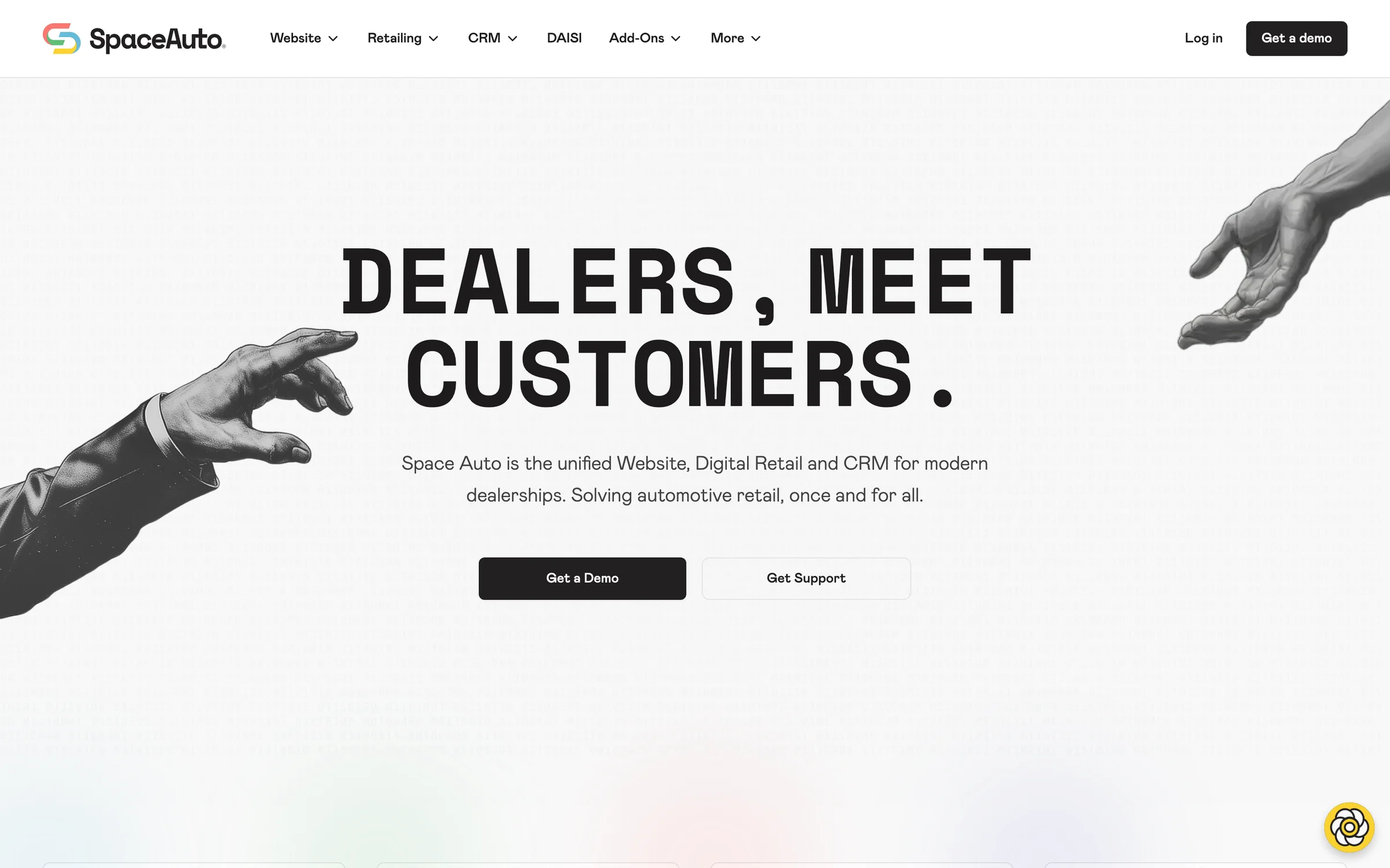
The Marilyn Monroe figure. Every AI assistant has a feminine name. I can't fully qualify why a male-named AI feels off, but it does, and it's worth not pretending otherwise. DAISI (Space Auto's AI brand) got a Marilyn-coded figure as a personification. She's a temptress, sure, but she's specifically a temptress beckoning the dealers out of the old and into the new. One Rive shows her whispering in a dealer's ear while he pulls the plug on a robot in a hospital bed (the robot is the dealer's old technology). She's not the assistant; she's the herald. She's the figure standing at the door of the next era waving the dealer in. That's a much more interesting role than "friendly chat avatar," and it lets DAISI carry real charisma instead of friction-free customer-service energy.
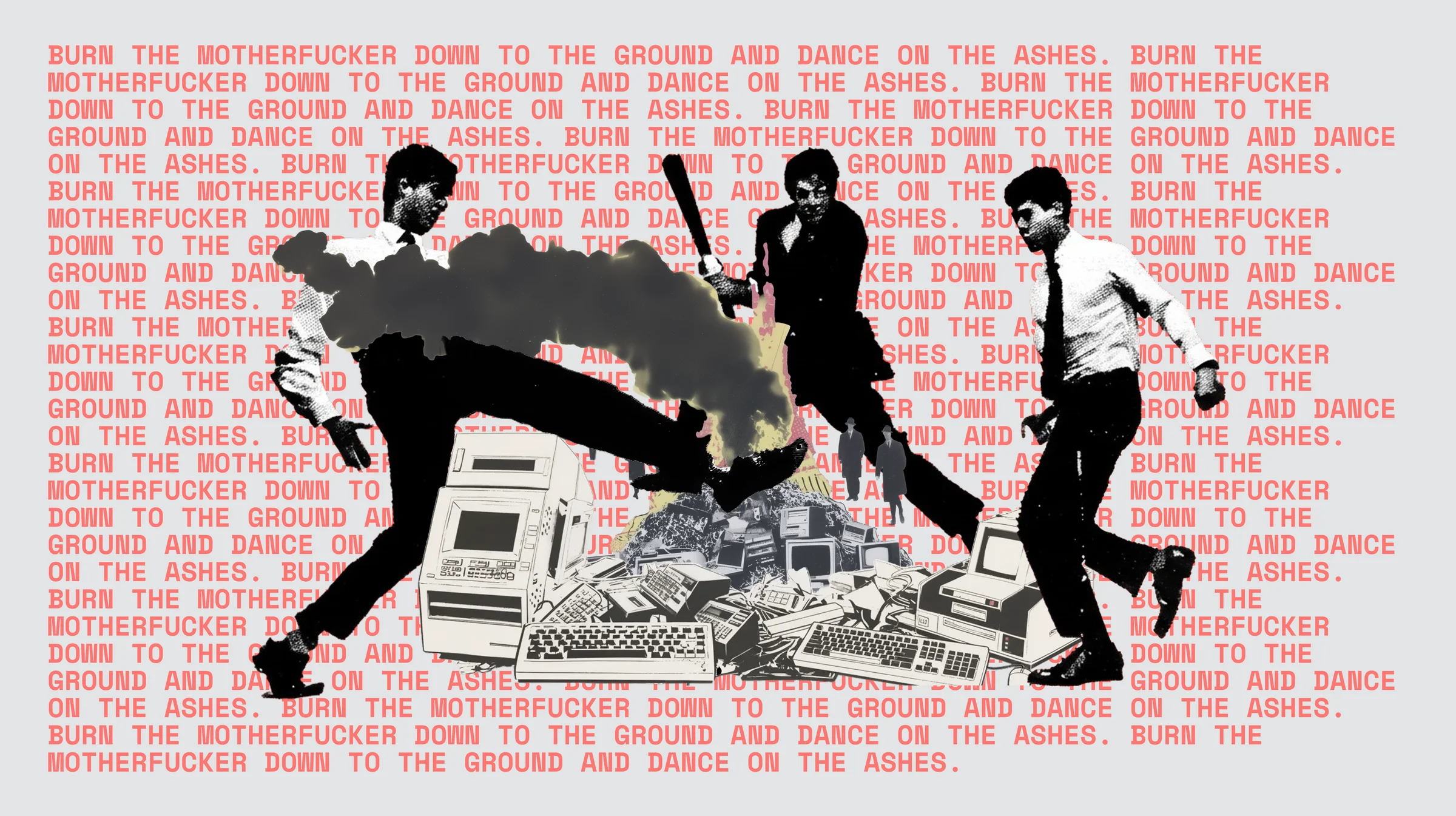
The Office Space thread: rebellion against the old systems. There is a famous scene in Office Space where the characters take a malfunctioning office printer out to a field and beat the shit out of it with a baseball bat. Dealers feel exactly that way about their current CRMs, DMSes, and websites. Every tool they pay for is something they wish they could destroy. So we put it in the brand. One of the CRM Rives shows three guys with a bat going to town on a vintage computer running what looks like MS-DOS on a blue screen. The messaging is intentionally negative: your current system sucks, take it out back, beat it to death, then come to Space Auto. Negative messaging is a third rail in B2B brand, but it's the right rail here, because it matches the emotional reality the dealer is already living.
Hidden punk lyrics everywhere. Throughout the site there are lines lifted from punk songs, embedded as microcopy, hover states, error messages. Small cultural Easter eggs that reward the people who notice. It's the brand winking at the dealer who is, behind the dad-coded exterior, a rock-and-roll person.
The rainbow as anti-discipline. This is a personal thing. I have a hard time committing to color. I tend to either use no color at all or every color, on brands that matter to me. Space Auto gets every color. The brand guidelines run almost a full rainbow, and rather than picking a single equity color and disciplining the rest out, I assigned color to product line and let the whole palette live:
- Digital retail / desking: purple
- Website product: green
- CRM: red
- DAISI (AI): yellow
- Integrations, support, retail, and others: their own slices of the rainbow
That looks undisciplined on paper. In practice it does two jobs at once. It reinforces product segmentation (anywhere a dealer sees green, they know they're in the website product; anywhere they see red, they're in CRM) and it makes Space Auto, as a parent brand, unconfusable with any other enterprise SaaS in the space. There is not a competitor in the category that uses color this way. The discipline is in how the color is used, not in how many colors there are.
The work
The S monogram
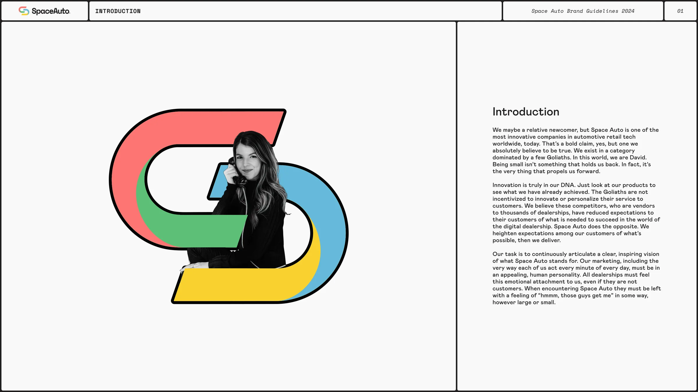
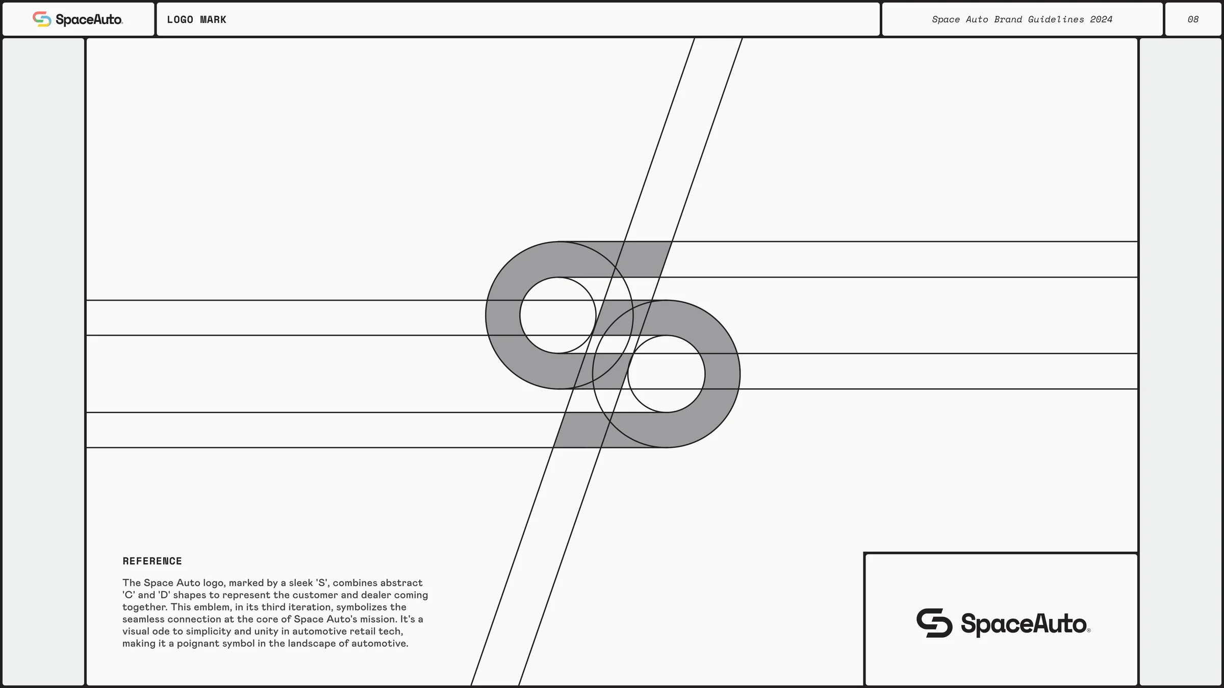
I didn't draw the original S. An outside designer named Clark did, and the smart thing about it is that it's a hidden C and D (Customer and Dealer) joined together into a single mark. That's a good idea, and I left it alone for years. What I did do was tighten the letterforms, pull the joins closer together, and replace the original solid color treatment with a multi-color version that lets the S itself become a small carrier of the rainbow system. The mark is one of the few places in the brand where the whole palette lives in a single object.
Typography and texture
Space Mono carries the brand. It's terminal-coded, technical, monospaced, and unmistakable. Pair it with a halftone-dotted, cut-paper collage of Marilyn Monroe and it becomes a punk-zine layout. Pair it with a solid green background and a hero headline and it becomes a SaaS product page. Same typeface, two different worlds, no rebrand required. The font is doing more work than any other single decision in the system.
The texture grammar (halftone dots, ransom-note cutouts, paper grain, real-time-animated photographic collage) gives the brand a handmade quality that almost nothing in enterprise SaaS has. Most software brands feel like they were generated. Space Auto feels like someone made it on a kitchen table.
DAISI: the seed of life
DAISI stands for Dealership Artificial Intelligence System Integration, and the name came from one of my favorite cultural moments in cinema: in 2001: A Space Odyssey, when HAL is being shut down, he sings Daisy Bell to Dave as his consciousness fades. That moment (an AI singing a love song to the human pulling the plug) felt like the right cultural reference for an AI brand that wants to be more interesting than a chatbot.
The logo is built from sacred geometry. Specifically, the Seed of Life: six circles arranged around a seventh, producing the Star of David and a structure that has shown up in heraldry, religion, and (notably) the OpenAI logomark. That's an interesting little wink, given how much of DAISI is built on top of foundation models from OpenAI and Anthropic.
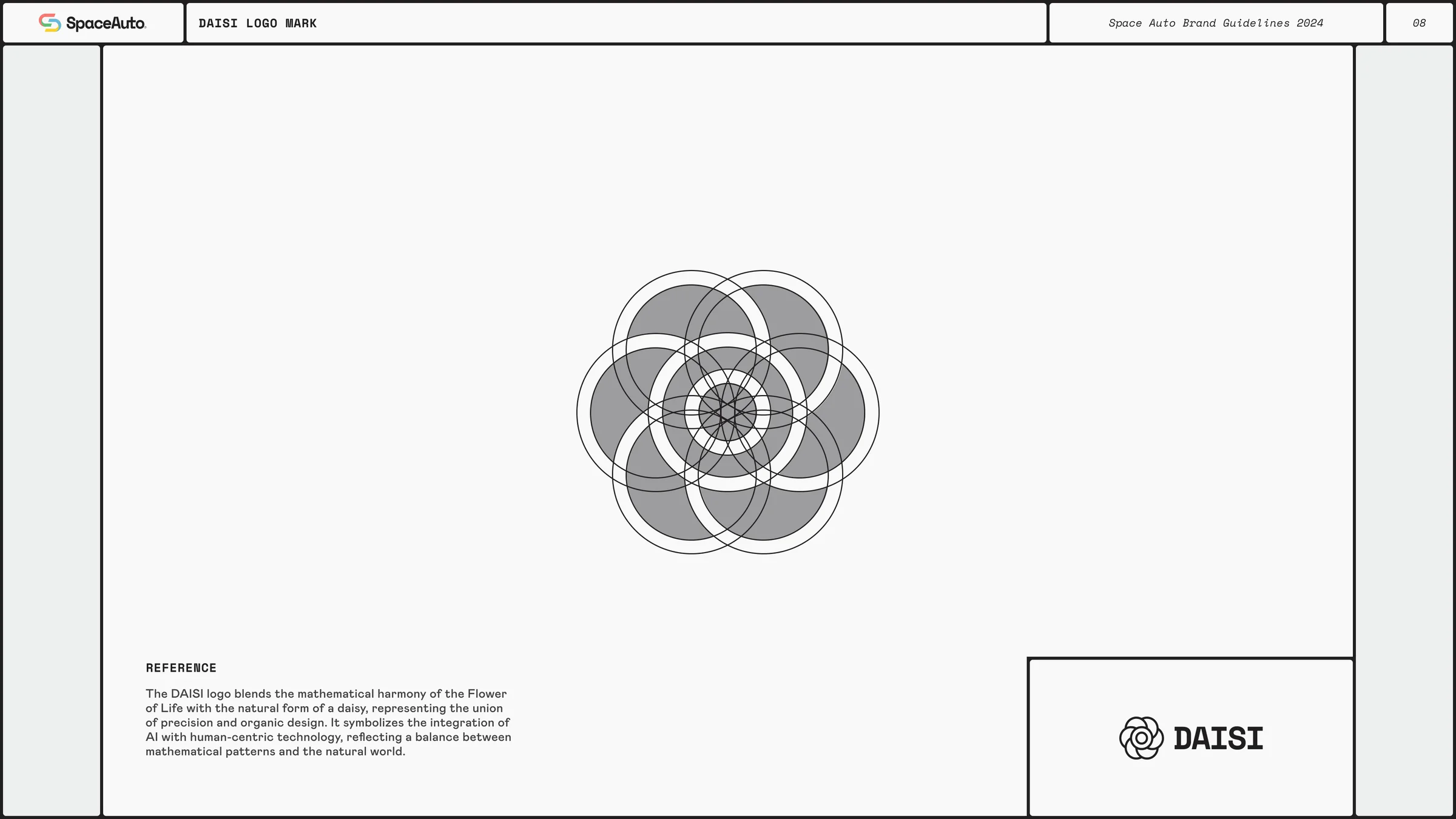
From that geometry, the mark resolves into a daisy with a small white circle at its center. The center circle reads like an eye, which gave us one of my favorite Rives: DAISI as an eye that follows the cursor around the page. It's interactive. It's alive. It's a little creepy. That last part is on purpose. We wanted DAISI to feel just slightly eerie (like the power behind it isn't quite understood) because that's actually how AI feels to most people right now and pretending otherwise is dishonest.
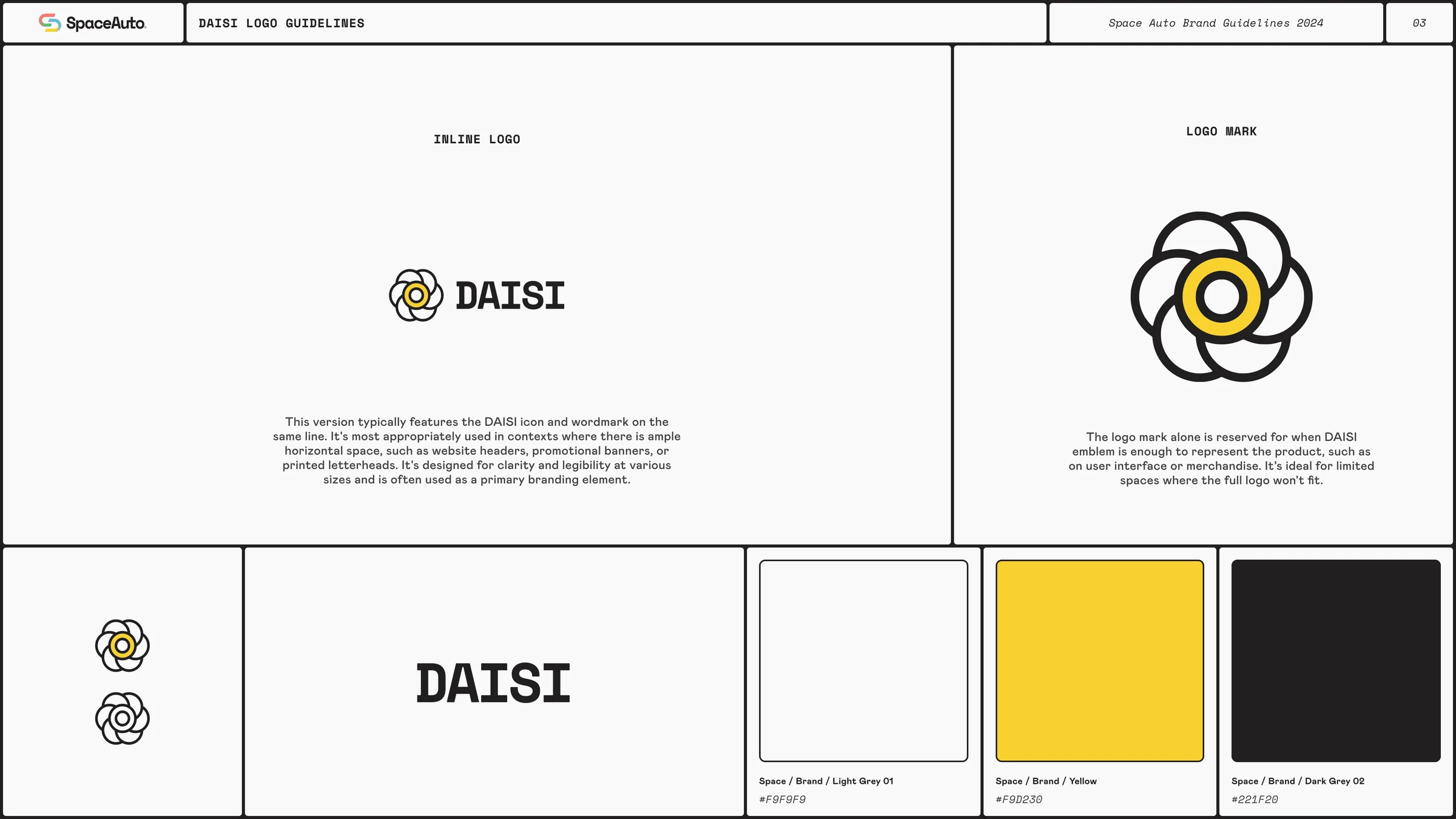
The yellow comes from the flower. The yellow gets to be unrestrained. DAISI is allowed to be sunny and loud against the rest of the brand, because in the rainbow system she has her own quadrant.
Pricing: Nothing to Hide
The pricing page got its own Rive, because pricing is one of the places dealers have been lied to most. Nothing to Hide is both the page title and the brand promise. The animation reinforces transparency as a product value, not just a marketing pose. In a category where every contract has hidden activation fees, surprise per-seat costs, and unenforced SLAs, leading the pricing page with a punk-coded we have nothing to hide is itself a competitive act.
The other Rives in the system
A few additional animations live throughout the site without needing their own scene-setting here. The touching-hands Rive (a Sistine-coded gesture between a dealer's hand and DAISI's) sits near the AI narrative as a humanist counterweight to the more aggressive collages. The contact-us-hero carries the conversational energy into the contact page. The support and website-retail-ui Rives back up the product pages. Twelve animations total. Each does a specific job. None of them are decoration.
What it became
The current site isn't quite my taste. For some legitimate technical reasons, the most recent rebuild went a little more sterile than I would have shipped if I were the only person in the room. I'm anti-Facebook-blue-sans-serif on principle. I don't hate where it landed. The emotion still comes through. The brand still reads as punk-meets-clean. The rainbow still segments the products. DAISI still has her eye on you. The Rives still carry the world.
What Space Auto became is one of the only brands in dealership SaaS that is unmistakably itself. In a category where every other vendor's website could be swapped for any other vendor's website without the dealer noticing, Space Auto looks like a band's website, sounds like a manifesto, and ships like a software company. That combination is the moat.
The brand world covers:
- The S monogram, tightened and rainbow-fied
- Space Mono as the typographic anchor
- A halftone / Dada / cut-paper collage texture grammar
- Twelve real-time Rive animations carrying the narrative across product pages
- A full-rainbow color system mapped to product segments
- The Don Draper figure as the masculine aspirational anchor
- The Marilyn Monroe figure as DAISI's herald
- The Office Space rebellion thread for CRM and replacement messaging
- Hidden punk-song lyrics threaded through microcopy
- The DAISI mark, built on the Seed of Life, that doubles as an eye that follows you
A small team taking on holding companies. Chest up, shoulders back. Poised like a goddamn ape.